Campaign Assets: Logo Design, Website Design, and Print Design
These are the three main design assets that dominate a presidential candidate’s campaign trail in terms of graphic design. A unique and distinct logo allows the voters to see their candidates as not just a personality but a complete brand – with a unique voice and a distinctive vision. The website helps the brand occupy a digital presence that is crucial in our tech-driven world. Lastly, the print design assets helptie up the whole promotional strategy nicely by offering more traditional methods of endorsement, such as flyers and posters.
With the logo design, the paramount thought is to keep the name center-stage and clearly legible. So you won’t see a lot of design experimentation in that regard. Minimalism and simplicity are the order of the day. Most presidential candidate’s logos sport their last names plus the last name of their running mate and the year of the election. Sometimes, the logo would also sport a unique tagline but mostly it’s just the name. The website design approach follows a similar pattern of to-the-point simplicity.
However, in all the simple and safe design, you will still see solid representation, powerful declarations, and interesting design choices.
Now let’s look at the design decisions taken by both presidential candidates and seeif their graphic design choices are as different as their personalities and political beliefs.
Logo Design
Commonly, a logo consists of three individual parts: an icon, a typeface, and thecolors. We’ll analyze each individual component separately.
Joe Biden
Icon
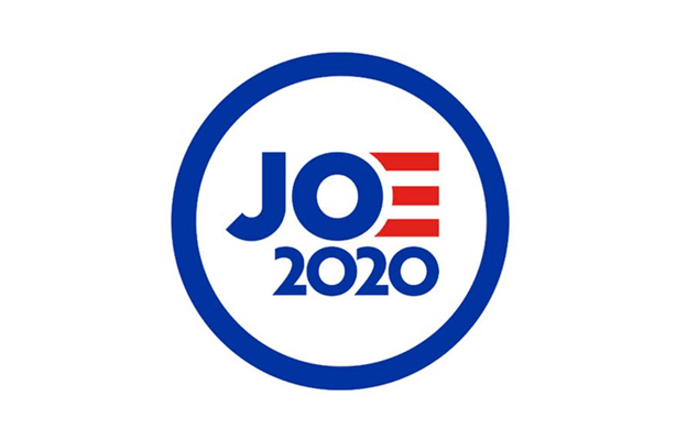
Most political logos, especially those of presidential candidates, consist of their names as their logos. Similarly, Biden’s logo is also a wordmark of his lastname. The letter E is illustrated as three red stripes. The three stripes keep changing colors to mark important days, such as taking Pride colors for the Pride Month.
The same striped E was used on Biden’s early logo when he officially announced torun for the president back in April 2019.
Immediately after its launch, the logo drew all kinds of unfavorable comments fromonline critics. It was deemed unoriginal, a rip-off of Obama’s logo, and some evensaid that the stylized E makes the whole thing disjointed and makes you read hisname as ‘Jo’. Not very presidential, right?
However, we are not going to hold it against Biden to try to play on nostalgia and remind people that he was associated with the first Black president of the country.The logo, on its own, works respectfully well.
Typography
The type uses a sans serif font in block letters. The sans serif font ensures the letters do not look too imposing, yet the block lettering prevents thelogo from looking too casual. His running mate’s name his last name is in smaller letters but in the same font style. If you look closely, you can find that Kamala Harris’ name is a lighter shade of blue. These design distinctions are introduced tokeep a kind of hierarchy in place.
Donald Trump
Icon
The Trump logo is similar to the Biden logo with respect to being a type-based sign. However, the similarities end here. The Trump campaign went quite a different route than his competition. Here, the icon is more forceful – enclosed in a boundary,making the logo look more official and forceful. The stars add more nationalism to the logo and make you think of the military.
To add hierarchy to the logo design, Trump and Pence have used different colors in the logo to represent themselves. The intention here is apparently to make you look at both of them differently.It can be interpreted in two ways. One, you are being encouraged to look at both the individuals as individuals who are bringing different sets of skills to the table and covering a wider base of issues. Two, the campaign wants you to focus on President Trump and let you know who’s in charge.
For hardcore Trump supporters, the second interpretation is what can seal the deal.
The icon concludes with Trump’s famous MAGA tagline and the year 2020 mentioned at the base of the rectangle.
Typography
logo also uses a sans serif font but the weight of the letters is much less.However, that must be due to the other details that needed space in the logo, such as the stars, the boundary, and the tagline. To keep everything neat, the designer sopted for a much smaller font size than what we see on the Biden logo.
However, the different color used for the VP candidate’s name takes care of the low-weight letters. Plus, don’t forget that Mike Pence’s name has been added using a different font, adding another layer of distinction in the logo.
The blue and red colors help break the logo into sections and make reading it much easier.
Website Design
Joe Biden
Homepage
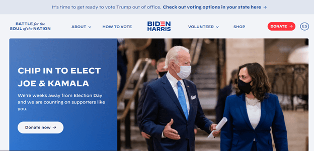
The campaign website sports a stylishly simple look. The homepage is clean,uncluttered, and very corporate. It uses a minimal design approach to present afresh, tidy, and professional look. The CTA buttons are present in two distinct colors:blue and red. The latter, however, is exclusively used to highlight donation information.
The important information regarding donation is also present above the fold to ensure easy access.
Biden and Harris are prominently pictured in their blue suits, complete with facemasks, and captured in a candid moment of what you can easily assume, is somein-depth political discussion.
The homepage is divided into distinct sections. There’s a common area at the top where you can find the most sought-after info such as the navigation bar, adonation box, and a prominent picture of Biden and Harris. Next, we see an onlineform to encourage volunteers to join, followed by the latest election news section,
and concluding with a strategic ‘Joe’s Vision’ area where major parts of Biden’ spolicy are expanded upon and captured through pictures and videos.
Navigation Labels
Navigation plays an important part in ensuring that visitors on a website can findwhat they are looking for with the least bit of bother and confusion. As an official website, joebiden.com does an impeccable job of using short, descriptive labels tomake navigating the website a breeze.
All of the navigation labels are descriptive, in block letters, and in campaign colors of lighter blue. The navigation bar also keeps things simple by storing only a small collection of buttons: only five.
This approach achieves two goals: a) allows the casual visitor to immediately findthe important information in the most common section (navigation bar), and b) letsa more curious guest explore the website by scrolling down and browsing morepages.
CTA Buttons
The buttons follow two themes throughout the site. The primary CTA buttons ofdonations, endorsers, contributors, etc. are in red, the rest in a blue and white combo. The combo is interchangeable. For the sections of the website that use ablue background, you will see white CTA buttons with blue letters. The opposite is true for the transparent/neutral sections of the website.
Hovering over blue CTA buttons highlights them with the subtle forward motion ofthe tiny arrow present on every button. The great thing about CTA buttons on thesite is that there are not very many –keeping the things purposeful and simple.
Photography
The photography on the website is a mix of nostalgic to reiterate the campaign message that we ‘know Joe’ and a lot of visuals (pictures and videos) of himmingling with families, women, kids, POCs to convey how he’s a liberal, communityman.
The photographs draw heavily on the Biden charm and capture him smiling in mostshots. You will also see him pumping his fists, hugging families of gun violence victims, and professional shots of him conversing with different people.
Typography
The typeface on the website is a clean sans serif going all around, except for the News section on the site. The approach allows visitors to immediately differentiate itthat part from the rest. The section headings in block letters with prominently in
white throughout the content, except for menu items, keep things uniform and on-point.
Language
The language, voice, and tone of the content and the message you get from it areall about community, future, hope, and promise. It is not grandeur, but more grounded, keeping in line with Biden’s image and charm. It’s all about ‘Team Joe’,including you, making you a part of the whole process. A powerful cognitive and psychological message.
Donald Trump
Homepage
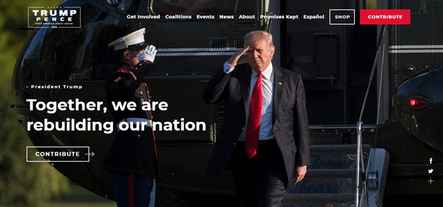
Trump campaign’s homepage takes advantage of him being the incumbent president. You can see a white house helicopter in the picture above, a marine saluting the president, and him saluting back. It’s all very proper and official.
The visual takes up the whole first fold of the homepage and presents Trump in a favorable light. The next fold is divided into a grid-like structure, dividing the page into sections dedicated to individual causes. There’s a donation section, a voting registration part, a volunteer registration form, and a section dedicated to ‘Promises Made, Promises Kept’ – something self-explanatory.
The color red is prominent throughout the website. It’s used in photography, in typography, in graphic content, and on CTA buttons too. There’s something that feels missing, though. President Trump’s campaign website – unlike Biden’s – does not have a dedicated media section. It may be due to the president not being very popular with the mainstream media, but it definitely puts a dent into the website content.
Navigation Labels
The navigation menu is short and to-the-point; the labels descriptive and clean. While the homepage does not make much hoopla about President Trump being in the news, there’s a separate page linked on the main menu that can take you to a dedicated space where the team maintains its own media responses and press releases.
Navigating President Trump’s campaign website has been kept quite simple. No dropdown menus here; things have been kept quite streamlined.
CTA Buttons
The call-to-action buttons on the website are in two designs. One, with a transparent background and a black border with blue typeface and another red one that’s been dedicated for donations, volunteer registration, buying event tickets, and such.
Under the Coalition menu tab, you will see that the CTA buttons follow the color theme used by the individual community coalitions that support Trump. You have a pink CTA button for ‘Women for Trump’ coalition, a black CTA button for ‘Black Voices for Trump’, a forest green CTA button for ‘Veterans for Trump’, and so on.
Elsewhere on the website, you see a more uniformed theme of transparent and red CTA buttons throughout.
Photography
President Trump has been a television personality and therefore knows how to work the cameras. We see a lot of rally pictures – a venue that is the president’s strength. We see him photographed in various power poses, hand waving, thumbs-up signing, and other shows of strength.
The merchandise section depicts an African American man in a MAGA hat, perhaps in a bid to counteract the opposition narrative of the president not being a favorite of the African American community.
Additionally, we also see a lot of families, women, teenagers, and young professionals photographed and presented on the official campaign website.
Typography
The typeface used by the designers is minimalistic. Simple, easy to read, and in an appropriate weight. The only thing that can be improved is the type color in various parts of the website that do not offer a dark enough background.
Language
Much like the president himself, the language on the website sounds quite assertive and authoritative. The content is filled with hope and promises. From the tagline to the news section on the website, and from donation appeals to volunteer registration, the tone remains hopeful and confident.
Print Design
Signs and Stickers
There is a huge variety of signs and stickers offered by the Biden campaign. In addition to logo stickers, you will also see a number of taglines designed into promotional stickers, buttons, and other material. Some popular ones seem to be ‘Build Back Better’, ‘I paid more income taxes than Donald Trump’, and ‘No malarkey!’.
Most yard signs do not follow any distinct designs and are mostly a reproduction of the campaign logo.
Posters
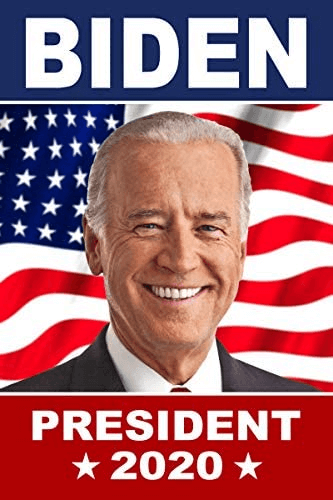
The Biden campaign does not seem to have invested much – or anything at all – on campaign posters. At least there are none in their online merchandise shop. However, we do seem to have found some online with some pretty respectable design.
Such as this one:
Since the campaign itself has not designed any promotional posters, we consider it an opportunity lost. With so much riding on these elections, not taking advantage of such a traditionally successful promotional material does not seem a smart campaign decision by the Biden side.
Let’s see how the Trump campaign has done.
Donald Trump
Signs and Stickers
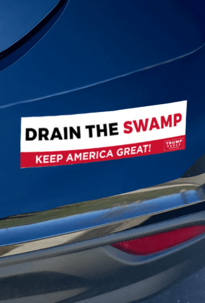
The design on the yard signs and most stickers that the merchandise shop of the president’s team is selling are just reproductions of his campaign logo. Some sticker designs represent the different community coalitions such as veterans and women.
You can also find stickers of popular campaign taglines such as ‘Build the Wall’, ‘Drain the Swamp’, and ‘Defend the Police’ etc.
The sticker designs again sport a generous smattering of the color red, drawing on the boisterous and assertive personality of the president. You will also see a lot of starts decorating these stickers, constantly drawing on the patriotic themes.
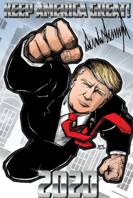
Posters
The president isn’t backing down without a fight – at least that’s what the graphic design of his posters is telling us. The over all design of the posters is patriotic and nationalistic. We also see parallels to physical strength and America’s great past hinted strongly in both the posters.
For die-hard Trump supporters, these limited edition posters not only work as great gifts but let them celebrate their favorite candidate in very
glorious presentations.


