Minimalist Examples
Since this type of design got its start in architecture, leapt to painting and other art, and filtered on down to graphic design, it is no surprise that it continues to be seen in a host of different areas.
And there are plenty of examples that we can compare.

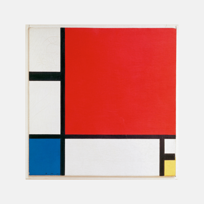
Image credit. wikipedia
The Nike logo, the famous swoosh, is a premiere example of minimalism logo design at its finest. It’s also a great demonstration of why minimal design is so difficult to define! Yes, the iconic logo designer used extremely a simple concept. But why does this “swoosh” work so well as a logo that has defined one of the biggest companies in history? There are plenty of thoughts on the reasons behind it, but it’s impossible to say for certain.
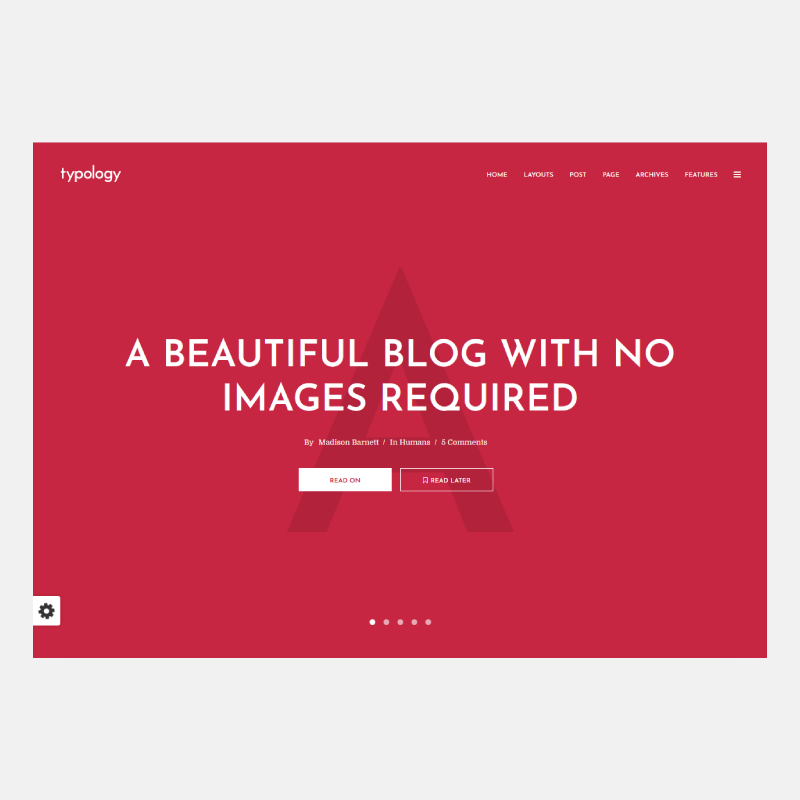
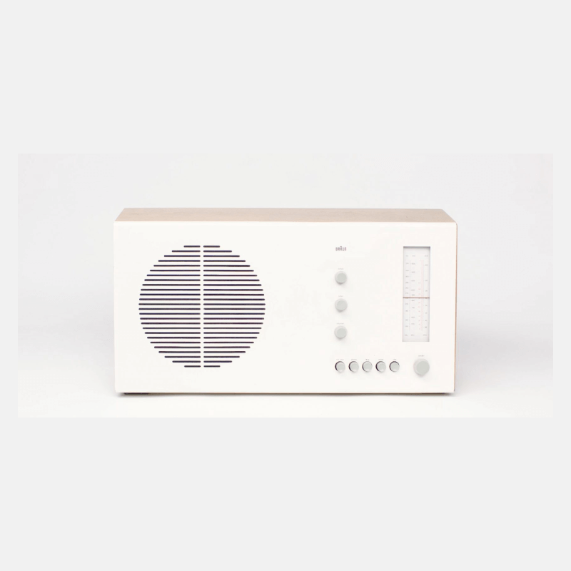
Image source. Themeforest
This WordPress theme, Typology, is clearly designed with minimalism in mind. With a limited color scheme, simple and clear typeface, and easy navigation, it’s a great example of how to do more with less.
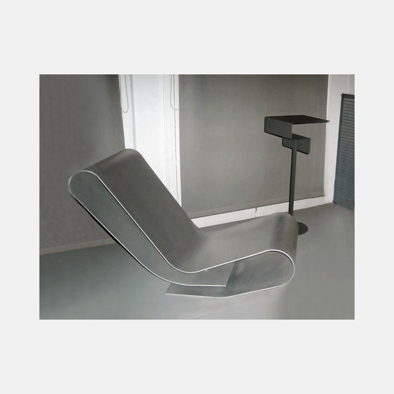
Image source. Nen Gallery
This low rocking chair is created with one unbroken stretch of material that is folded, not bent, to create something both functional, unfussy, and interesting.
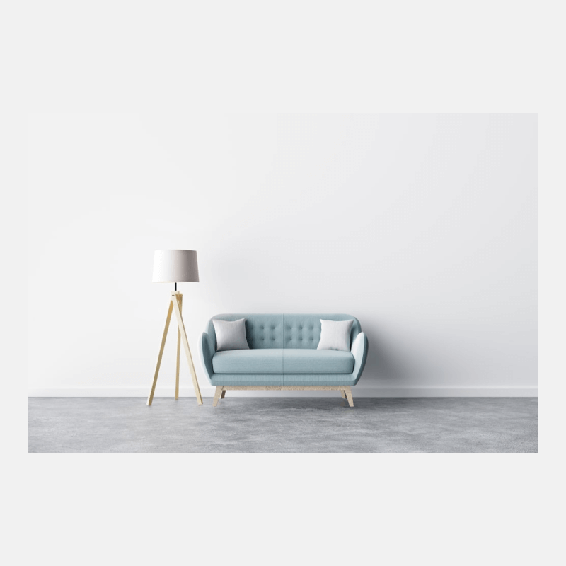
Image credit: istock.com/Ali Siraj
Minimal design has left its mark in the home, as well. This minimally decorated living room has a few potential focal features, but nothing that demands attention, and overall the feeling promoted by this layout and color scheme is calming, soothing, and tranquil.

Image credit: istock.com/Ali Siraj
This graphic background is an unusual example, because at first glance it does seem to have a lot more going on than just the minimal. But it uses repetition, which can be a loophole for minimal design in order to add extra elements in without adding to the complexity of the design as a whole. And the color scheme, while not exactly “black and white,” is still muted and singular enough to qualify as a simple palette.
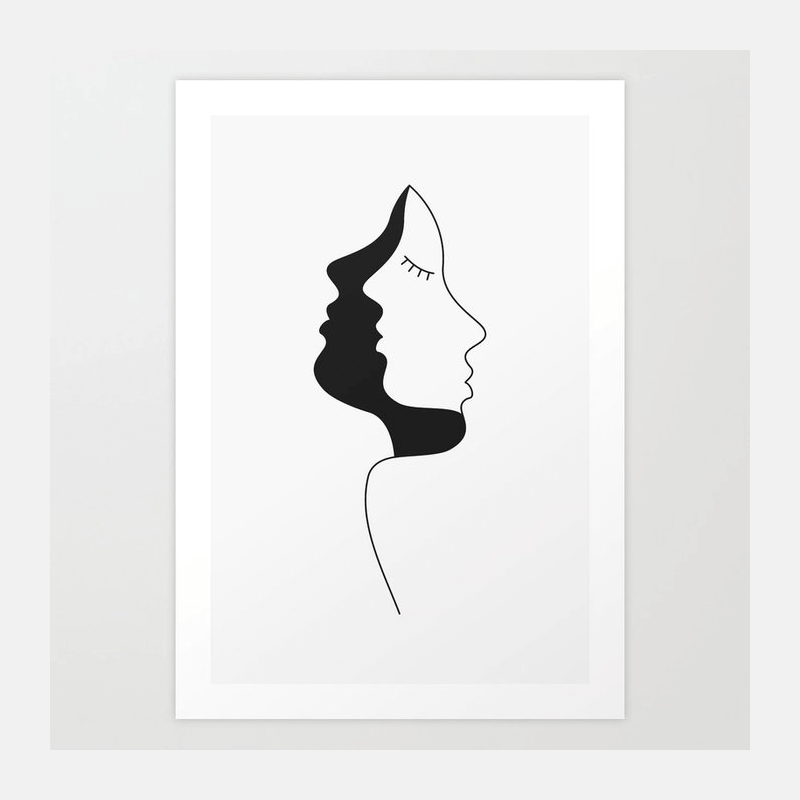
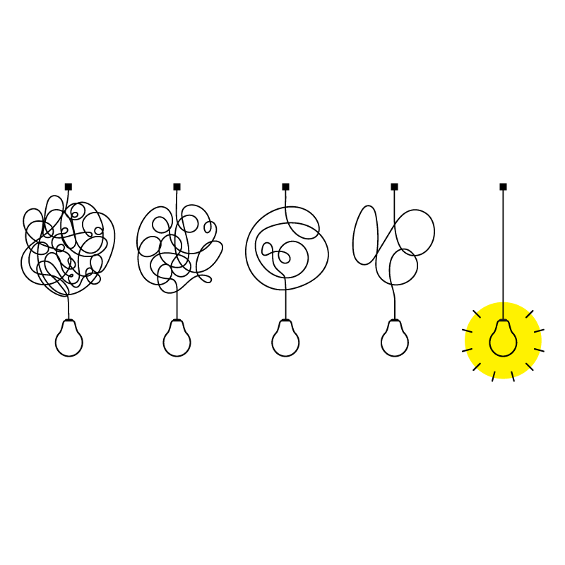
Image credit: The Design Salad
This minimal piece of art is an excellent demonstration of how to use white space as an integral, important part of minimalist design. With only a black and white color scheme and only a few lines, the drawing is able to pack a lot of punch and meaning in a small space.

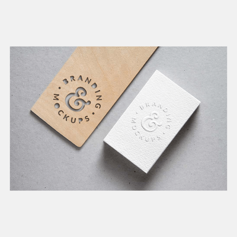
These mocked up logo designs show how minimal design can be truly functional when executed correctly. Each one incorporates a visual element that corresponds to the point of the logo, and each visual element doubles as both a typographical and an iconic feature.
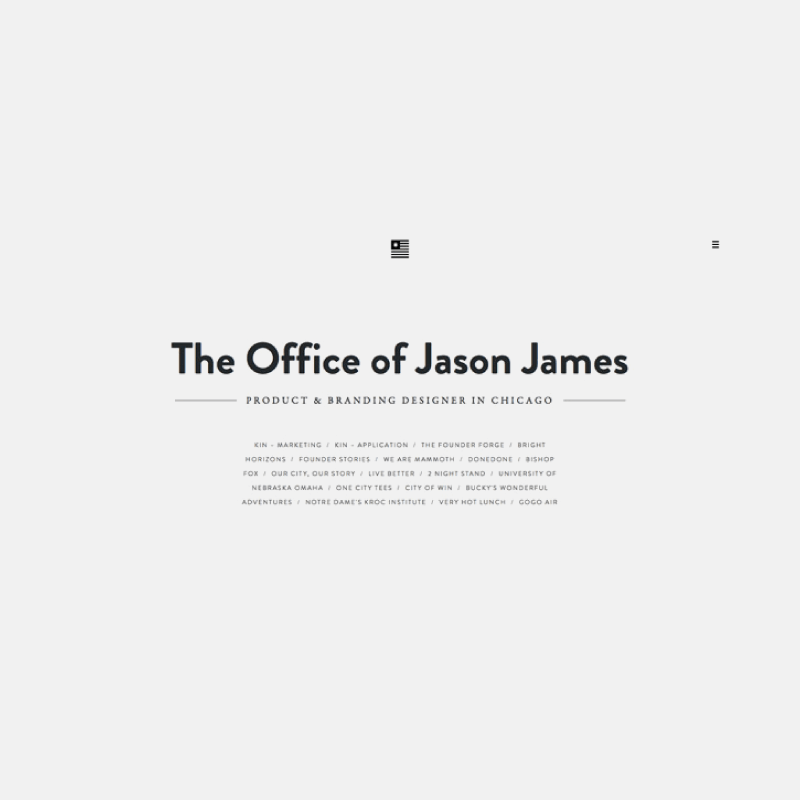
Image credit: I’m Creator
This professional web design layout illustrates the “to the point” helpfulness of minimalism. It gives all the necessary information, presents the navigation up front, and lets the visitor get on with what they need to get on with, without distraction.
The value of examples from other areas is that many of these still follow the same basic principles that minimal graphic design does: keep it simple, as few elements as possible, don’t obscure the message.
So, ultimately, even though some of these examples are from other arenas, they still carry lessons for us as graphic designers.