How to Design a Hand Lettered Logo using Procreate and Illustrator

Hand Lettering has been around as long as language itself has existed. Looking back on the hieroglyphics of ancient Egypt to the stunningly detailed calligraphy designs of the middle ages, we can easily observe humanity’s desire to convey messages in beautiful, unique ways.

In modern day logo design, hand lettering has made a resurgence. But this trend spans from poorly chosen font renditions from design apps to painstakingly detailed work of Instagram-famous sign painters. It can be hard to tell what is professional hand lettering and what is not. Bad hand lettering is hard to define, but you likely know it when you see it because something about the piece feels off. It doesn't have to happen with your designs!

Balance, composition, and flow are all important things to keep in mind when creating a unique logo design for your client or yourself, but the two most important things to focus on when it comes to hand lettered logos is readability and cleanliness.

If, at a glance, you're unable to read your final logo design, then it might be time to reconsider style, layout, line width, and kerning between your letters. The purpose of designing a perfect logo design is to make sure it's legible and able to convey your clients’ message through the design.

Before beginning any project, take time to sketch through your design and ensure that you can read it, both close up and far away and that it adequately portrays the style and aesthetic of your clients' desires.

Perhaps one of the biggest hurdles for hand letterers is transforming a hand lettered design to digital without 1) losing its character and 2) creating a clean final product.

TUTORIAL: Getting Started with Hand Lettering Logo Design

It's time to learn how to create a hand lettered logo design from a rough sketch to the polished execution using design softwares like ProCreate and Adobe Illustrator. In this video, graphic designer Lilah Higgins is demonstrating the step-by-step process of designing a logo from a hand lettered sketch.

For today's logo, she chose a playful, but clean hand lettered design, with a simple brand element hidden within the letters.

This tutorial will walk you through the basics of transferring your design from a hand drawn sketch to a professional final product which can be used digitally and in print production.

TOOLS USED:

  • Sketch Pad
  • Pencil
  • Inking Pen
  • iPad w/ProCreate
  • Adonit Stylus / Apple Pencil
  • Computer w/Adobe Illustrator

Step One: Sketch and Ink Your Design

Using Pinterest or a font that inspires you, decide on the style of your lettering. Then begin your sketch and edit as needed by erasing and editing as you go.

After you sketch out your design and are happy with the results, trace over your sketch with a dark or black pen. As Lilah went through this design, she gave it a little bit of a personality by upping the ascenders and lowering the descender lines of the letters.

Step Two: Take Photo and Import into ProCreate

Within ProCreate, choose a new file by pressing ‘+’ in the upper righthand corner. Choose a size that’s at least 2000px in width so you have a high resolution design. After your new project opens, tap the wrench icon > press Add (the + icon) > choose Insert a Photo > choose the photo of your design.

Make sure your Stylus of choice is connected and double check your brush settings. Lilah prefers the default brush under Inking, called Gel Pen. Tap on the brush for settings and make sure StreamLine is set to at least 50% for the cleanest lines possible.

Create a new layer before beginning your tracing!

Then tap + hold on your color pod in the upper righthand corner and drag down to fill in your outline.

If you want to keep a separate outline, be sure to copy your layer before beginning to fill.


Step Three: Export to Illustrator

After you’re satisfied with your tracing job, tap the wrench icon on the upper left hand corner. Choose the Share (up arrow icon) > Choose PSD > Airdrop to your computer (or email the file to yourself via your email app of choice)


Step Four: Trace and Isolate Image

When importing, a pop up screen with appear. Make sure you check “Convert Layers to Objects” so each layer is converted and separated out for easy workflow. Click the layer you want to start with. Choose “Image Trace” > Expand > Right-Click to upgroup, click away and then delete all white pieces by choosing Select > Same > File Color > and pressing the Delete Key to remove any white pieces created by the trace.


Step Five: Refine Image

Using the pen tool, clean up your design, straighten out any lines, clean up edges, and clean up curves.

To learn more about how the Pen Tool works, click here.

Add additional elements, drop shadows, outlines, or change colors as needed.


Step Six: Add Final Elements and Colors

For this specific design, add an Outline Stroke by going to Object > Path > Outline Stroke and setting it to 8px.

Then add a drop shadow under Effect > Stylize > Drop Shadow, setting it at Opacity at 75% and blur at 0.07%.

That's it! For easy share and recall, I've repeated the steps in this infographic.


Now that you have your logo, you can use it to brand your products or even marketing materials like t-shirts, business cards, marketing materials and so on. Just be sure that the essence of your logo remains consistent in all your branding materials.

Different Lettering Logo Design Styles

Styles can vary when it comes to lettering design. Here’s some ideas to get you thinking.


Classic Calligraphy

Calligraphy lettered logos, in particular Arabic calligraphy logo designs, fall under a strict set of rules, namely where the ascending lines are thin and the descending lines are thicker. This style tends to have the outcome of a more classic, polished logo than other styles. Calligraphy designs can be created with a classic nib and ink set up, or within apps like ProCreate with specialized black letter brush downloads.

Image Source


Brush Lettering

Brush lettering is a loose, flowing design, either created with digital or real paint brushes. It can cover a variety of different emotions and styles, but usually ends up with a lot of personality and charm. Brush lettering can be accomplished on both paper and digitally, but lacks flair when created completely digitally, start with a good old paintbrush and a dark medium.

Image Source


Art Nouveau

Nouveau has an antique feel and it’s origin is from sign painters of the 1910’s. This style is more victorian and clean, but still carries the flair and individuality of hand design. Nouveau styles are easiest to produce digitally first, since precision is of the utmost importance. But to challenge yourself and practice your skill, grab a ruler, a pencil, and a very large eraser.

Image Source


Art Deco

Art Deco is a throwback to the 1920’s era and it is characterized by extremely high or low x-height, and more than not accompanied by filigree designs and geometrics. For accomplishing designs like this, keep in mind that the extras around your lettering is just as important as the lettering itself. Focus on the overall shape of your letter logo design first, and then incorporate the words for a cohesively stunning finished product.

Image Source

Famous Hand Lettered Logos and Their Stories

One of the most common reasons for hand lettering in logo design history is because founders wanted to make their mark on the company, and therefore use his/her own handwriting in the logo design. Over time, these logos have been refined and rebranded, but there’s something especially charming about the original owner casting vision into the lifespan of his/her company’s most iconic image.

Here’s a few stories about the origin of some of the most iconic hand lettered logo designs:

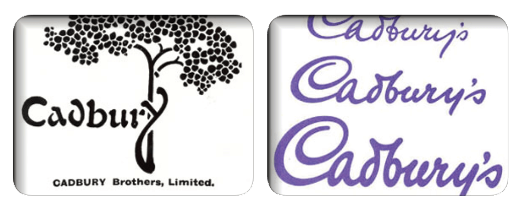
The famous Cadbury script logo was first introduced in 1921 and was based on William Cadbury’s signature. It was a major modification from the previous elaborate tree logo. Initially, the signature was difficult to replicate as a brand logo but was simplified over the years to accommodate this challenge. In 1952 the script logo was used in all major product lines.

Kellogg’s logo has an interesting story. Company legend has it the founder William Keith Kellogg used to sign each corn flakes box personally to demonstrate the genuinity of their products. Gradually, the personalized signature was upgraded to become the company’s logo. Today, the updated hand lettered signature is a redesigned version created by Interbrand.

Kleenex Logo by Saul Bass, 1980

One of the most influential logo designers of his time, Saul Bass was known for his clean lines, iconic logos, and timeless designs. Bass proved that even hand lettered work can stand the test of time, remain memorable, and compete with modern trends with his Kleenex logo design.

When considering using a hand lettered design for your company or your client, take into account your audience. Hand lettered logos can work well in any industry, but the lettering style in which you choose depends greatly on who will be most attracted to your design.

For example, with brands like Cadbury, Kellog’s, and Kleenex, the audience was taken into mind. These are all household brands, marketed to homemakers and the ones doing the shopping and likely the cooking. Each of them brands over 50 years old, they originally marketed to housewives and mothers. The fun, inviting aesthetic is disarming, cute, and clearly doesn’t take it’s message too seriously. At the same time, these brands are trustworthy, strong, and established. You can see the growth from a classic and charming to a more clean and modern as the culture grew with its audience and included any parent or guardian.


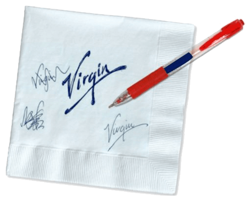
Finally, a more punk-rock style of lettering was used in Richard Branson’s iconic brand, Virgin.

According to Virgin's brand story a young designer scribbled the company’s name on a paper napkin which became iconic when Richard Branson saw and fell in love with it for its “simplicity, attitude and energy”.

The handwritten logo became the company’s signature as well as representation of it's brand persona as the disrupting, exciting and innovative brand of the world.

Hand lettered logos have incredible potential in the world of branding and marketing today, but as a designer, it takes practice and intention to create a timeless design that is both professional and conveys the right message to the right audience.

Author Bio: Lilah Higgins is a designer, illustrator, and artist currently based in Northwestern Wyoming. Taking her fine art training and strategic mind into the online space, she helps clients brand cohesively and effectively across platforms, bringing them the confidence they need to become industry leaders. You can find more about her and her work at www.lilahhiggins.com.

This article has been reviewed and verified by Zaheer Dodhia, an expert in logo design and branding.