How to Design an Accounting and CPA Logo: A Step by Step Guide

As an accountant or CPA, your reputation means a world to your business. However, it’s not just numbers that clients need to bestow their trust in you. If your brand is not trustworthy and reliable, you will find it challenging to gain the trust of your clients regardless of how skilled you are. Whether you run a successful accounting, CPA, bookkeeping, or other financial solutions, having a well-designed logo is one of the best ways to build the foundation of a trustworthy brand.

Before you create your accounting and CPA logo, you need adequate information and inspiration. This article outlines the best logo design advice you cannot find anywhere else. Relax and keep reading!


Accounting Logo Best Practices

Some of the best practices in accounting logo design include;


Color

Accounting and CPA brands never shy away from color. Similarly, investment and finance logos come in all hues and shades. Even though these niches don't go too deep with bright colors, they coordinate their brand colors to create logos that stand out. Some brands go bold with popping colors, while some choose to remain classic in black and white. When creating your accounting firm logos, stick to one or two colors so that the end product doesn't distract your prospects and compromise customer trust.

It's worth noting that every CPA firm logo should display high levels of professionalism. Don't use flashy colors or complex designs. Your goal should be to keep it simple and elegant. Besides, all you want is a logo that will attract your customers and look good on different materials, including business cards designs and stationery.


Layout

The best CPA firm logos look just as classy on a letterhead as they do on a billboard. To achieve this flexibility level for your brand, you cannot afford to go wrong when choosing the layout. Minimalistic graphical designs, neat layouts look amazing across a variety of mediums. However, in case you don't want to limit your layout options, the wisest decision is to create several variations specially made for different mediums.


Symbol

When creating your logo, the selection of accounting symbols goes a long way toward determining whether it will be successful. The symbols you choose act as an extension of the products and services you provide. They reflect your personality and resonate with clients who share a similar personality. Generally, your fonts, colors, and symbols should complement each other. This will create a long-lasting impression of your brand!

As a rule of the thumb, don’t use symbols that are unrelated to the types of services you provide. For instance, if you run a bookkeeping firm, it makes more sense to use books or graphs as your symbols instead of an arrow bar or shield logo. Similarly, if you own an accounting firm select a calculator logo instead of bank or dollar symbols.


For CPA symbols, you can use bank building graphics, dollars, currency, coin symbols, as well as charts, and other relevant images to create a lasting impression.


For both CPA and accounting logos, you can use text logos in case you fail to find the ideal icons for your needs.


Typography

The typeface you use for your finance and investment logo design can communicate your brand’s style and seriousness at a glance. If you check most accounting logo images, you will notice that most of them feature bold, visible sans-serif fonts. This ensures they are readable across different applications and sizes.


Typography is an accounting logo factor you should not overlook in the design process. You may consider analyzing the typeface your competitors use to tell whether yours sticks out from the crowd.

You might use the best customizing graphic design program and choose the best coin currency or money symbol to create your accounting firm logos, but you will fail if you ignore these best practices that have made major brands what they are today. Before you sit down and begin the design process, make sure you re-re-read this part and make the best out of it! Good Luck!


How Accounting and CPA Logos Should Look Like?

Basically, your accounting and CPA logo should represent your brand and your personal taste. However, ensure your logo design contains images that symbolize different values based on the services you provide. Remember, your logo should effectively communicate if you are a CPA or an accountant, and should not cause any confusion to your prospects.

When creating your company logo, you need to make it as professional and as business-oriented as possible without compromising aesthetics. When selecting images or accounting symbols, such as shield, line graph and arrow logos or even a tree symbol like the logo below, make sure they are simple, yet sleek and elegant. Shun away from complex designs when possible, since it takes away from the proper and professional appearance of your logo.
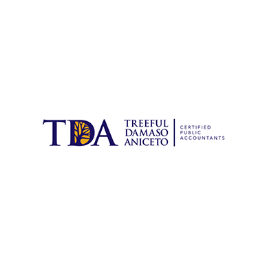

Image: TDA CPAs


In some instances, using your company’s initials to represent your brand is better than using images. Therefore, determine what you want for your business and make a prudent decision!


Is a CPA Logo the same as an Accounting Logo?

A CPA is a designation received after one completes specific work or educational requirements and passes an exam, while an accountant is someone who has earned an accounting degree in an institution of higher learning.

Based on the fact that accounting and CPA are two different things, it means that CPA and accounting logos are not the same. To understand the differences between these logos, you need to know the differences between the professionals.

Basically, a CPA is better qualified to undertake accounting duties than an accountant, and most, if not all, governments recognize CPAs as credible experts in accounting. People who have received the CPA designation have been trained in the industry's best practices, and are better positioned to perform more complex tasks than accountants. Generally, a CPA receives better pay than an accountant.

Your CPA logo should look like those of some of the famous brands including KPMG, Ernst & Young, Deloitte, and PwC.


A Certified Public Accountant is permitted by law to perform various duties that regular accountants can’t do. For instance, they can act as a taxpayer representative or prepare audited financial statements. An accountant who hasn’t received a CPA cannot perform these duties.

Your accounting firm logo should look like those of famous brands including BDO USA LLP, and Crowe LLP.


Why are Accounting & CPA Logos Confusing?

Factually, you don't want your logo to communicate to your prospects that you are a CPA while you are an accountant, and vice versa, since this can hurt your brand. You want to create a logo design that will tell your clients exactly what you do, and help you develop strong, mutually-beneficial relationships that last for years.

To ensure your CPA logo or accounting logo doesn’t send the wrong information to your clients, develop a well-crafted brand message which is persuasive, inspiring, and attractive. Ensure it contains the essence of your brand, including the qualities you stand for and the specific services you offer, make sure this information is explained using as few words as possible.


Image: EddyCPA

Image: JCS

Image: CrossAccounting

Image: FreshBooks


Factually, creating a good brand message that will tell clients what you do is tricky, and can take you a long time to solidify it. In case you don’t want to make your message long, simply use a concise tagline that says who you are and what your business stands for. For instance, you can say, “Trusted & Reliable CPA” or “Your Accounting Needs Matter.” These taglines clearly state what you do to everyone who comes across it.

Type of brand messages your CPA or Accounting Logos Should Communicate

Your logo should communicate all or any of the following messages:


Features of Your Services

A brand message in a logo that is immediately recognized by people is that which depicts your business's literal function. Therefore, to ensure that your prospects know whether you are a CPA or an accountant from your logo design, include a word or short sentence that summarizes your services' features.


This logo shows that the services provided are at an expert level, and this can help a prospective client develop a sense of trust with the brand. You can use it as an inspiration when creating your own logo!


Service Benefits

After you communicate your services' features in your CPA logo or even accounting logo, let your clients know the benefits they will gain from your business. A message that communicates benefits is highly compelling since it highlights the essential aspects the buyer is looking for.

When creating your accounting or CPA firm logo, make sure you depict the professional feeling and the unique benefits your prospects will gain by working with you.


Brand Qualities

Including the qualities of your brand in your logo can go a long way, helping your clients know whether you are a CPA or an accountant. You don't need to write a long message to tell your clients what you do. Qualities can be communicated visually through colors, imagery, and fonts. A simple arrow bar or chart within your logo can tell the client that you are CPA, and you offer incredible auditing solutions.

Look at this example:


The brand name in the logo itself shows that the business is accountable. This is one of the best ways to communicate brand qualities using your logo.


Core Values

Another aspect that should be in your logo as a CPA or accountant is your core values. Core values are basically high-level concepts such as connection, strength, excellence, safety, and peace that drive people towards a particular action. The core values you include in your logo are based on your core values as the business owner. Therefore, if you believe that your business will provide reliability and affordability, make sure you include that in your logo.

Broadcasting your core values through your logo is one of the most powerful ways to capture your target market's attention. This way, your branding efforts will bear fruits in no time.

Look at this Example:


Trust is a value taken with high regard by clients across all industries. By using a logo to communicate trust, this brand can go a long way in building and maintaining relationships with clients.

What Should your Logo Communicate?

Most CPAs and accountants fail in branding because they bestow the responsibility of determining the messages that their logos will communicate to their tech teams. Don't make this mistake! As a business owner, you are constantly in touch with your prospects, and you understand their unique needs and demands. Therefore, you are the person who is in a better position to determine the message your logo should communicate to them.

Nonetheless, you might not come up with the ideal message for your finance consulting logo or CPA firm logo design if you are not a self-aware business owner. You can search CPA logo ideas or various accounting logo ideas to get a glimpse of the type of messages you should visually convey with your logo. In case this doesn’t help, you may include your team in the decision-making process.

Ensure you go as deep as you can with your message. The deeper your message goes into the essence of your brand, the more long-lasting and memorable

your message will be.

When to Involve a Logo Designer or a Brand Strategist

Sometimes, you might try coming up with a design that will visually communicate the brand message you intend to pass across. Suppose everything around communicating about your CPA or accounting logo seems too complex or esoteric, or you simply have no time to dedicate to it. In that case, you may consider working with a professional logo designer or brand strategist.

A brand strategist will help you distill various aspects of your business, and come up with a coherent list of qualities, core values, and messages that will make your business gain an edge over the competition. A logo designer will help you choose the fonts, colors, icons, and everything else you need to create a perfect logo.

Even though you may involve a logo designer or brand strategist to help you out, you should still remember that you own the brand. Therefore, the strategies and insights the deliver should feel right to you and should reveal your ability to solve clients' problems. The logo design you adopt at the end of the day should be tailor-made and reflect what you want to communicate with your audience.

Three Inspirational Accounting Logos

Based on all the information above, you are probably opening a new tab on your browser in a bid to find accounting and CPA logo images that will give you some inspiration to create a logo that will help you show the world how incredibly cool you are. Below are some of the best accounting logos that will soothe and motivate your creative bones!


Clark Silva

Apart from using incredibly visible fonts, this logo features amazing colors that give it a modern, sleek, and clean look. The abstract arrow icon not only gives prospects direction, but it also adds some glamor to the already attractive design.


ProTax

We like the clever way the designer has used the letters in the name in negative space making it a tidy and professional accounting and tax logo design for the firm. The fact that the name of the consultant’s qualification (CPA) also tells about their expertise.


Rand CPAs

Nothing spells more modern, simple and professional like this logo. The choice of muted blues gives the message of trustworthiness, which their profession requires; and a touch of yellow denotes they are energetic and enthusiastic in their work. The thin font gives a very sleek look coupled with the modern bar charts completes the picture of a modern CPA logo design.


How to Choose a Font for your Accounting and CPA logo

Speaking of fonts, how important is it? How to choose ione for your logo?

Let’s consider this: you have downloaded the best accounting logo designs and accounting symbols, such as line graphs, shields, calculators, and chart logos, and you are ready to begin designing your accounting firm logos. You even have inspiration from multiple CPA logo ideas, but there is one thing you can’t get right – The font!

The font is an essential part of any accounting logo. You should never underestimate the importance of selecting the right font. When you choose readable fonts, you will go a long mile in passing your brand message to the consumers, and this will result in business success. An inappropriate font will evoke nasty emotions and might undermine customer trust.


How to Select Fonts for CPA/Accounting Logo Designs


Types of Fonts

Regardless of the program you are using to create your consulting logo or CPA firm logo, you will come across various fonts. The main ones include:


Serif

Serif fonts have small vertical lines at the end of every stroke. They are classical fonts that communicate reliability, comfort, tradition, and reverence. They include Trajan, Georgia Italic, Baskerville, and Times New Roman.


Sans Serif

These are fonts that have a contemporary look and have no serifs. They communicate neatness, novelty, and aspiration. Examples include Calibri, Myriad Italic, Helvetica Bold, and Franklin Gothic. AvantGarde Bk BT, MicrogrammaDBolExt, Montserrat, Flama


Display Fonts

They are those that do peculiar jobs and are not common in CPA logo images. They express uniqueness, friendliness, and emotional richness. They include Valencia, Giddyup, and Space-age Round.


Modern Fonts

Modern Fonts are modern-style fonts that communicate style, elegance, decisiveness, and progress. They include ITC Avant Garde, Futura, and Extra Light.


How to Select

Research: Research your fonts by looking at competitors and fonts databases like Font Squirrel, Google Fonts, Da Font

Final Thoughts

A good logo for your accounting or CPA firm is more than just an image. It is an essential point of recognition for prospects and a critical foundation for the branding of your business. A well-designed logo is a perfect way to convey to your clients that your business is trustworthy, professional, and offers quality services that are hard to find. Designing a quality logo is easy. However, if you cannot do it yourself, consider seeking the help of a seasoned graphic designer.

Reviewed by Zaheer Dodhia, CEO and Founder LogoDesign.net