How to Design Your Own Real Estate Logo: Tips, Tricks and What to Expect

Real estate is big business. As of November 2020, there were nearly 107,000 real estate companies operating in the United States alone, and that doesn’t even begin to cover other real estate-adjacent businesses, like property management.

Each year, more and more agents get their licenses and start to operate. So it’s no surprise that there’s a consistent need for marketing and branding materials to help these new businesses make their mark.

Due to the intense competition that exists in this market, it’s important to have a well-designed, effective logo that will accurately represent the company and carry some of the marketing load.

If you’re an agent yourself or starting your own real estate firm, you’re probably wondering, “What is the best way to design a real estate logo?”

You could hire a graphic designer to design a custom logo for you. But if you’re interested in doing it yourself, you may find that the design journey is simpler — and more rewarding — than you might think.

On top of that, designing your own logo is the best way to get your real estate logo free of charge.


How To Get Inspiration For Your Real Estate Logo Design

The first question that you will come across when designing your own real estate logo is simply this: Where do I begin?

Logo design can seem like an overwhelming task. After all, there are many elements that go into an effective, memorable design. And your logo will be the most commonly seen piece of branding, representing your company in the mind of your audience.

The first place you can start in searching for inspiration is your company itself. Take some time to analyze what motivated you to pursue this career, and what goals you have set for your company.

Look at the facts of your business, as well. Consider the locality in which you operate, the type of real estate you handle, and whether you also offer property management, mortgaging and loan services, and other services that may be useful to your clients. (If you’re specifically looking for tips on creating your office logo, or a logo for any other real estate-adjacent businesses, keep reading! Those will be addressed later on in the article.)


You can also take the time to assess your target audience. What demographics will you target? Who will you market to? What type of clients do you hope to secure, and what will they expect from you? Analyzing the needs of your clients and how you can fulfill them can help you to pinpoint graphic elements that should be included in your design. For instance, if you work in a rural area, you may want to develop a farmhouse logo. If you operate in a city or urban area, an apartment logo may be more appropriate to your services. And if you deal chiefly in commercial property, you may develop a large building logo that illustrates the nature of your area of expertise.

All of these are good preliminary ideas to help you on your logo design journey. But you can also turn elsewhere for inspiration.


Where To Find Real Estate Logo Ideas

Logo designers often look to other designs for hints on what does and doesn’t work within a particular market or niche. Of course, that doesn’t mean that you simply imitate the logos that are already in place. You want your business to stand out from the crowd, not blend in because it looks too much like other logos.

But popular, well-known logos can give you some ideas of both what works within the market, and what might be expected by your audience.

Logo design elements are like a shorthand. If you choose graphics, colors, and fonts that your audience are familiar with, the logo will send a message to the viewer about what they can expect. You can find popular and commonly used property logo images by searching for the logos of existing companies.


The logo for Engel and Volkers, as an example, uses not just a simple house graphic, but a stately home as their brandmark, along with their name. Using a house logo for a real estate company has been so overdone in the past that it may seem to be an old hat. But when done correctly, it can be very effective.

Brokerage firm Exp Realty, likewise, uses a stylized and simple house graphic for its logo.


Taking the time to analyze popular and even famous logos from well-known and successful companies can give your inspiration a boost.

But you may be surprised at what you find when analyzing trends in this market.


Trends In Real Estate Logos And Marketing Materials

The first thing that comes to mind in real estate logo design is probably something like the house graphics mentioned earlier. Or, perhaps, you may think in terms of a key logo, which would work both for a real estate firm and for adjacent markets, such as investment logos. Both of these are clearly identifiable with the real estate and house-buying market. Symbolism isn’t really necessary.

But a quick glance at logos belonging to some of the most successful real estate firms in the world shows that not only do most of them not use such graphics — many of them don’t use any graphics at all.


Firms like Century 21, Aaron Kirman Partners, and the Corcoran Group all use wordmarks as logos — otherwise known as simply using the name of the company, without including a graphic element. For these companies and many more, the color palette and font choice is what makes the logo stand apart from the competition.


Other famous companies, such as Luxury Portfolio International — perhaps one of the most famous luxury real estate logos — uses a stylized monogram for a logo.

These firms are all well-established, and most of them operate worldwide. So you may feel that their example isn’t the best one to follow for a smaller, hometown firm that operates in the local area.

Still, it’s an interesting trend to note. You can alternatively use a logo maker tool like Logo Design to generate your design ideas, it’s up to you.

Most expert designers suggest using a combination mark for a new company, ie., a graphic and a wordmark, the name of the company. This type of logo is excellent for establishing recognition of a new business, and can be adapted as necessary by using either one of the elements.

How Professionals Design Real Estate Logos

The logos we’ve mentioned thus far, of course, have been designed by large graphic design houses or marketing firms. You may feel that, in designing your own logo, you’ll never be able to achieve the look, style, and memorability of such logos.

However, don’t give up just yet.

Another trend in graphic design, and one that is generally recommended by professionals working in any market, is this: simplicity.

The most effective and memorable logos are the ones that are the simplest.

That’s part of why the trend runs toward wordmarks and monograms. And it’s also what is heartily recommended for your own combination mark real estate logo design

Professional graphic designers follow a simple step by step process for designing logos.

  • Step one: Analyze the company, including goals, brand personality, audience, and competition.
  • Step two: Brainstorm several different ideas that incorporate the correct messaging for the company.
  • Step three: Develop a rough draft into a fully-fledged design, including choice of fonts, colors, and graphics.
  • Step four: Get feedback, double-check that each element fits the company, and adjust as necessary.

A four step process sounds pretty simple, doesn’t it?

Ideally, logo design should be simple, both in the design process, and in the end result. But there are more elements that need attention. Let’s take a look at how to choose the best fonts, colors, and graphics for a real estate logo.

Design Elements: Choosing Fonts, Colors, And Graphics

Choosing the individual design elements for your logo should be dictated by a few key components:

  • Memorability
  • On-message
  • User-friendliness
  • Versatility

Each of these components should play into the decisions you make. And satisfying these requirements really depends on the nature of your business, as well as your brand personality. Remember to go back to the first analysis of your company and let that guide you as you choose each element.


Choosing Your Font

It was already mentioned that one of the most common trends in famous real estate and property company logos is the “logotype” style. This type of logo simply uses the name of the company as the logo. It can be designed with the full name of the company, if it’s not too long, or using the initial letter or letters in a lettermark or monogram style.

With this trend, the importance of font choice is really highlighted. It’s absolutely imperative that your font choice be readable and legible at different sizes, as well as when used in grayscale or with limited colors. It needs to stand out against the background color or image. And it must clearly identify your company name.

The most common type of font for real estate and property development logos is sans serif. Sans serif fonts make sense for this market; they are typically seen as straightforward, clean, modern, and trustworthy.


If you’re interested in searching out the perfect font for your real estate logo, sites like Google Fonts and Typewolf are excellent tools to help you narrow down your choices.


Choosing Your Colors

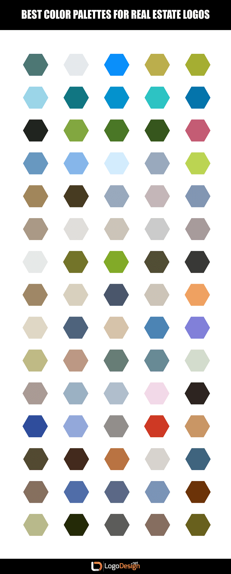
As mentioned, fonts need to stand out clearly and legibly against background colors. So let’s take a look at the best color palettes for a property dealer logo.

More often than not, color choice in graphic design is heavily influenced by two things:

  • Trend
  • The psychology of color

Trends come and go, and vary from market to market. For the real estate market, and particularly property logo design, the most common color trend is blue. Closely following up this ever-popular choice is a combination palette of black, white, and gold.


Of course, simply because certain color choices are more common within your market isn’t the best motivator to choose those colors. The more important factor is what color fits your company, including the overall aesthetic of your branding and design. Keep in mind, too, that the last thing you want is a design that looks like every other property advisor logo out there — you want to stand out from the crowd.

All that being said, trends can be a helpful hint as to what colors should be considered.

The psychology of color, meanwhile, gives designers extra insight into how the colors they choose will likely be perceived by the audience they’re targeting. And analyzing this area of research makes it clear why certain colors tend to trend.

Blue, for example, is seen as a soothing, trustworthy, familiar, and comfortable color. It’s ideal for a company that markets homes to families. It’s also the most popular color in branding.

A combination palette of black, white, and gold, meanwhile, brings an element of distinction, dignity, and respectability to a logo. It’s probably no surprise that these colors are most often seen in larger, more affluent companies that deal in luxury sales.


Choosing Your Graphics

If you’ve decided to try out a combination mark logo design for your realty firm as most experts suggest, then you’ll need to give some consideration to the graphic that you choose. And not just the graphic, but also the style. Remember, your graphics are sending a message to your audience, just like your font and color choice.


Consider, as an example, the difference between a property management company that uses a landscape logo, and a company that uses a cityscape logo.

Obviously, each one sends a very different message. If you went to a city-based real estate firm and found that they used a rolling landscape for their logo, you’d probably be taken aback, because that’s not what you expected at all!


Real estate logo images don’t need to be centered around buildings or landscapes, however. Coldwell Bankers, for example, uses a simple star within their combination mark. You could also get inspiration from elements like a key, a garden, a tree, or a compass logo image.

If you’re working within a specific area, it’s worth considering a logo image that reflects your hometown, such as a rendering of local sights or landmarks.

Remember that your logo must be a certain type of image in order to ensure that it doesn’t degrade when blown up or shrunk down. Real estate logo vectors are the only type that will ensure versatility.


How To Use Real Estate Logo Makers And Other Design Tools

You’ve come this far — but what if you’re starting to doubt that you can create your own real estate logo after all? Is it starting to seem like it’s just too much work for someone without design experience?

That’s where logo makers and other design tools come in. Sites like Logo Design help you through the process of creating a free real estate logo. It’s easy to use, and you can even take a look at some other real estate logo design samples if you need further inspiration.

Ideally, you should be able to put together a free property logo within a short period of time, once you’ve done your preliminary research.

Designing A Logo For Property Management

Along with real estate firms, there are plenty of other real estate-adjacent businesses that have similar needs and which can use similar logo design inspiration. Let’s take a look at a few of them.

  • Property Management Logo. If you’re looking for property maintenance logo ideas, your inspiration will depend heavily on the type of property you work with. Residential, industrial, apartments, rentals, and agricultural will all draw from this factor.
  • Home Insurance Logo. This market is closely tied to real estate, as it’s often a requirement of buying a new home, depending on the state you live in and the area the house is located. It’s a little less trite to use a home logo or building logo for this type of company, so these types of graphics are recommended.
  • Lending and Mortgage Logo. Another necessary market that comes along with the real estate niche, mortgage companies often use more symbolic graphic elements, such as keys and compasses.
  • Architect Logo. Frequently, small building design companies work along with the real estate market to find clients who either want to build from scratch on their newly-purchased property, or who want to change aspects of their new house to make it suit their needs as individuals. Architects, carpentry logos, and construction firm logos can also draw from the keys to real estate logos, though we also suggest using specific design elements for graphics, such as windows and front doors. Stylized graphics work well for this type of business logo.


Regardless of the type of logo you need to create, if it ties back to real estate, it’s a safe bet to follow the trends and suggestions outlined here. Make use of the property logo ideas we’ve included, and adapt them to fit your company.

Making Your Logo Work For You

Now that you’ve put together your real estate logo, what’s next?

Simply put, it’s time to make it go to work for you!

Your logo should be used as an ambassador for your brand. Use it for branding your company including your website, and on marketing materials such as business cards, emails signatures, pens, signage, and anything else that you use to promote your business.

Now that you know that designing your own real estate logo isn’t an impossible task, you can expect to reap the benefits of creating a free real estate logo that is tailored to your company.

Reviewed by Zaheer Dodhia, CEO and Founder LogoDesign.net