
- All
- Accounting & CPA
- Advertising
- Agriculture
- Alphabets
- Animal & Pet
- Apparel & Fashion
- Arts
- Attorney & Law Firm
- Auto & Transportation
- Beauty
- Childcare
- Cleaning
- Communication & Media
- Community & Foundation

The key to designing any logo is getting to the heart of the matter: what message should the logo be sending?
This is doubly important when it comes to organizations that intend to promote a deeper spiritual meaning. If you’re designing religion logos or spiritual logos for an organization that goes by a specific system of beliefs as their guiding principles, it’s not enough just to put together a quick church cross logo and expect that it will reach the heart or accurately portray the character, belief system, or denomination of the church.
There is a huge variety in spiritual symbols, often based on the history and background of the belief system. On top of that, there are tons of different spiritual images that could be incorporated into the logo. Regardless of your particular beliefs, as a professional graphic designer, it’s important to pay attention to the history and meaning of religious symbols.
Certain images, fonts, and colors tend to be more common and popular in faith logo design, and similar choices are found for organizations and businesses that are often religiously based, such as seminary schools, Islamic schools, donation centers, and even funeral homes.
Let’s take a look at some of the most common religious symbols as they are used in identification of organizations, and how they can be used properly and respectfully in religious logo designs.
We’ll also cover popular fonts and colors.

In covering religious symbols, the Encyclopedia Britannica refers to them as a group as “the basic and often complex artistic forms and gestures used as a kind of key to convey religious concepts.” Because they are found in all religions worldwide, they should be viewed as the “representation of the holy in certain conventional and standardized forms.”
The most common religious symbol worldwide is the cross. Interestingly, the cross as a religious symbol was used long before the onset of Christianity, although it has come to be viewed by many as the typical symbol of Christianity. For example, regardless of what denomination is represented, if you see a building with a cross on top, it’s pretty easy to assume that the building is a Christian church.
The cross is a great example of how culture and time can shape the meaning of a symbol, especially as used to represent something like religion. Although it has pagan origins, very few Christian religions recognize that it was not originally identified with Christianity. And even fewer refuse to be identified with it, because of its history.
But the cross isn’t the only religious symbol that you might consider when designing a logo for a church or other spiritual organization, and there’s a good reason for that — not only because of its origins, but because it’s in extremely common usage. Designing a logo around the image of a cross won’t help your logo to stand out from the others, which, in turn, won’t be very helpful in properly identifying the organization the logo represents. So simple cross logos should be carefully considered.
Here are some other religious symbols or images that could be appropriate for the logo design. Keep in mind that there are some 4300 religions currently being practiced worldwide so this is by no means an exhaustive list.
Dove: The dove is viewed as a highly religious symbol, as well as being a symbol of peace. Within the context of the Bible, it pops up in several different accounts, but notably, its reputation for being viewed as a religious symbol comes from the account of Jesus Christ’s baptism, where “God’s spirit descended like a dove.” This is such common imagery that a dove logo could also be called a spirit logo.
Church: The icon of a church is frequently used in church logos, and they often resemble each other to the point that they are difficult to tell apart. If you do a simple search for “free church logos images” for example, you’re likely to come up with four or five very similar logos, using a simple building silhouette, usually with a window and a cross on top. There’s nothing wrong with going with this design, if it is appropriate for the organization, but it should be noted that they are basically a dime a dozen; if you can add an unusual twist to make it more personalized, that is definitely worth the effort.
Minarets: A minaret is the tower portion of a mosque, with a very distinctive dome silhouette. Minaret logos would probably not be appropriate for a Christian organization but this article is about spirituality and religious imagery in logo design, so it may be something that is called for in your particular project.

Crescent: This is less commonly seen in “traditional” religious symbolization, but does pop up in spiritual design, and is often used in conjunction with other religious elements to indicate acceptance of a wide range of diverse beliefs. The star and crescent symbol is viewed as indicative of Islam among other things, so if you have need of an Islamic logo, it could be employed there.
Book and Bible: Again, a Bible or book logo is fairly common for a Christianity-based organization, whether a church or something peripheral to a church, such as a school. Churches will often use a black book silhouette with a cross cut out, or an open book silhouette.
Angels: Line drawings or artistic representations of angels are at times used for religious graphic design. Angel logos strike the same tone as the dove mentioned earlier.

Image Wooden Angel
Jewish Star of David: Again, the use of this icon really depends on the appropriateness for your logo design and the organization you’re designing for. Jewish
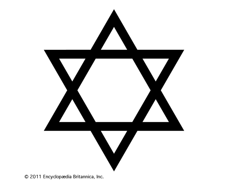
Image Britannica
Jesus fish: The simple outline of the Jesus fish, or ichthys, is a frequently used symbol of Christianity, and pops up all over the place, from spiritual logos to the back windows of SUVs.
As mentioned, care and caution should be exercised when using religious icons or imagery in design. Make sure that you won’t step on anyone’s toes or offend someone needlessly. Do your research before you use a religious symbol.
If you’re looking for other instances of how religious symbols have been appropriately used in design, there are plenty. And not all of them are directly tied to a religious organization.
For example, approximately a third of the world’s flags have a religious symbol on them.
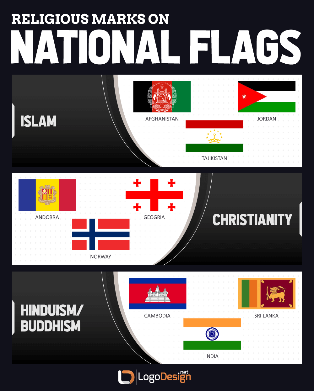
Image Religious Symbols in Flags
Religious symbols are even used at times in advertising though certainly with mixed results. This is actually a good warning example — consumer response to religious symbols in advertising and marketing can be mixed, to say the least.
If the person who handles the marketing and advertising knows what they are doing and uses the symbols respectfully, it can serve as a form of shorthand to reach the audience and let them know that they have something in common with the advertiser. If the symbolism is handled badly or inappropriately, however, it can do a lot of damage to the advertiser, and turn people away.
This is true even if the advertiser has good intentions; in this throw-back article from the Los Angeles Times, it talks about a number of “Christian” companies that used scriptural references and religious imagery as a way to connect with their target audience. One example, notably, was a carpet company called “Born Again Carpet Care.” Blatant leverage of religion may appeal to some consumers, but can turn away others who see it as a misuse of belief systems, or those who don’t share that particular belief.
It’s the same basic principle behind a church logo designer deciding to call their design studio “Good Lord Logo Design.” Some viewers might smile, and others might think it’s just a cheap joke making light of a serious matter.
The point is, once more, that care should be exercised — and that each designer has a responsibility to do their research before they use a religious symbol in their design.
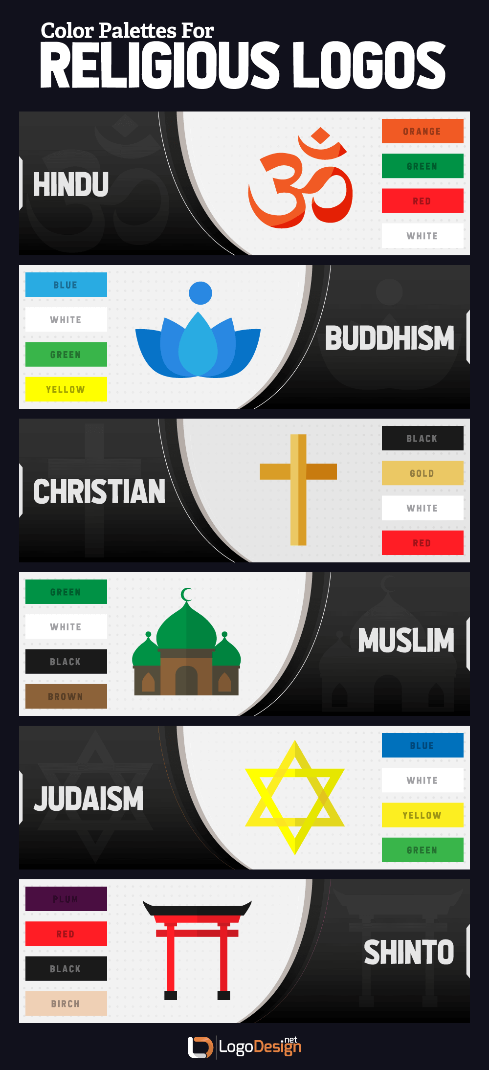
Along with certain symbols and images, the choice of color is another important consideration that says a lot about the organization behind the logo.
Every logo designer should take the commonalities of the psychology of color of logo design into account, even if that area of study isn’t the deciding factor behind the color palette you choose. This is because, although it isn’t an exact science, people do tend to react to colors in certain ways.
Many factors play into those typical reactions, including culture, age, and gender. But, especially within the United States, certain colors are commonly viewed certain ways.
Any analysis of religious logo colors will likely show that designers realize this, and leverage the psychology of color in order to send the message that they want to with their color choices.
Here are a few popular color choices for religious logos, and why they are chosen.
Blue: Blue is a popular choice for a lot of reasons, not least because it’s a favorite color with both men and women, and its popularity spans many age ranges as well. Blue is seen as soothing and trustworthy, both traits that a religious organization would want to promote actively.
Image Stone Church Logo
White: White is symbolic of purity and virtue, and is often used along with another color in religious logo color palettes.
Orange and yellow: These are warm, welcoming colors, so it’s easy to understand why religious organizations like temple logo makers would use them to appeal to viewers.
Image Decatur City Church
Purple: This is a royal color, and in terms of specific religious connotations, it can be seen as representative of God’s kingdom, making it a popular choice for Christian logos and gospel logos, such as seen here.
One thing to be cautious with, in terms of choosing your color palette, is not to go all out and use a bunch of different bright colors. This can be seen as being attention-getting for the sake of the attention, rather than promoting a spiritual outlook.
You probably have heard about the psychology of color previously — but did you realize that there’s a whole area of research into the psychology of font, too?
Yes, the font you choose — even the type of font you choose! — will also send a message about the organization behind the logo, so it’s important to make sure that it harmonizes well.
Basically, you have a few different types of font to choose from.
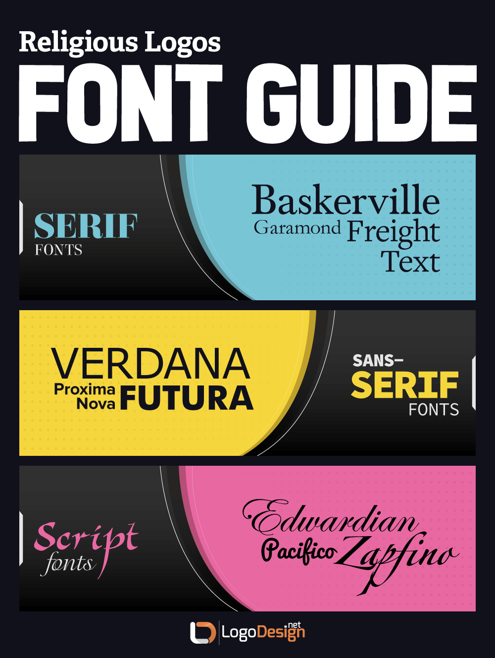
Serif. These types of font are seen as traditional, trustworthy, classic, elegant, and impressive. They’re more formal, and give a feeling of reliability.
Sans serif. More modern, cutting-edge, and adaptable, these fonts typically put function before form.
Script. While imparting a sense of creativity and out of the box thinking, script fonts are also elegant, stylish, and sophisticated.
What is interesting about these three different types of fonts is that they are all appropriate for religious logo designs — it just depends on the type of religious organization!
A serif font would be great for a traditional church, especially a denominational one that is rooted in tradition and history. Think of Baskerville or Garamond, for example.
A sans serif font is an excellent choice for a non-denominational, “mega-church” type of organization, appealing to younger audiences. Futura or Verdana are good possibilities.
And a script font is a fantastic choice for a “new-age,” non-denominational organization that is focused on spirituality rather than a specific
religion. Zapfino or Edwardian are both excellent choices.
No font is considered more of a “spiritual font” than any other, but as you do your research within the niche you’re working in, you may very well find a certain type of font that is in common usage.
Of course, different types of font can be combined to great effect, and this is common practice for content with more to it. For a religious center design, however, it’s probably best to stick to one font, or at most two. Ensure legibility and proper sizing and spacing, and make sure, too, that your font shows up well against the background, whether it’s an image or a color.
Now that we’ve gone through some of the specifics in religious and spiritual center logo design, it’s a good time to take a look at how all of these elements can be combined.
No matter what you’re creating a logo for, the basic design process is the same. However, for a logo for a religious center or similar organization, the first step is more important than ever: do your research.
Get to know the organization behind the name. Find out the answers to questions such as these:
Because there’s such a large potential for values dissonance, make sure to take plenty of time to get to the bottom of those questions. Know who and what you are designing for; that’s the only way to ensure that you create a religious or spiritual logo that matches the organization it represents.
Once you have that clearly laid out, you can move on to the actual design process. Analyze which icons or imagery would be appropriate for your logo. Check these against any existing logos, to ensure that your organization doesn’t get lost in a sea of look-alikes regardless whether you are creating a Buddha logo design or Islamic school logo.
Rather than relying on stock photos or imagery, consider sketching out your own original version of the religious symbol. This is a great way to add a unique touch to even the most commonly seen icon.
In fact, it’s always recommended to sketch out your ideas before you start to develop them in digital form.
Image Church on Rock Logo
Using color psychology, choose a palette that isn’t too bold or too muted, and which doesn’t distract from the central message of the organization.
Once you have your base for the logo, choose a font that matches the message and emotion behind the name.
As you develop your logo, keep in mind that the finished product should be a religious or spiritual vector image — that’s the only way to avoid any corruption of the logo when changing the size.
Go back frequently and double-check your work against your pre-design research, to make sure that the design continues to fit in with the organization. And don’t be afraid to ask for feedback from others — and then edit and adjust accordingly!
Ultimately, the goal is to end up with a logo that accurately and attractively represents the organization that you’re designing for. The only way to do this is to pay close attention to your client’s needs and wish list.
We’ve grouped religious and spirituality logo design together up until now. But there is a difference, and a lot of that has to do with identity — both of the religion behind the organization, and the nature of the organization itself. Let’s get into the specifics.
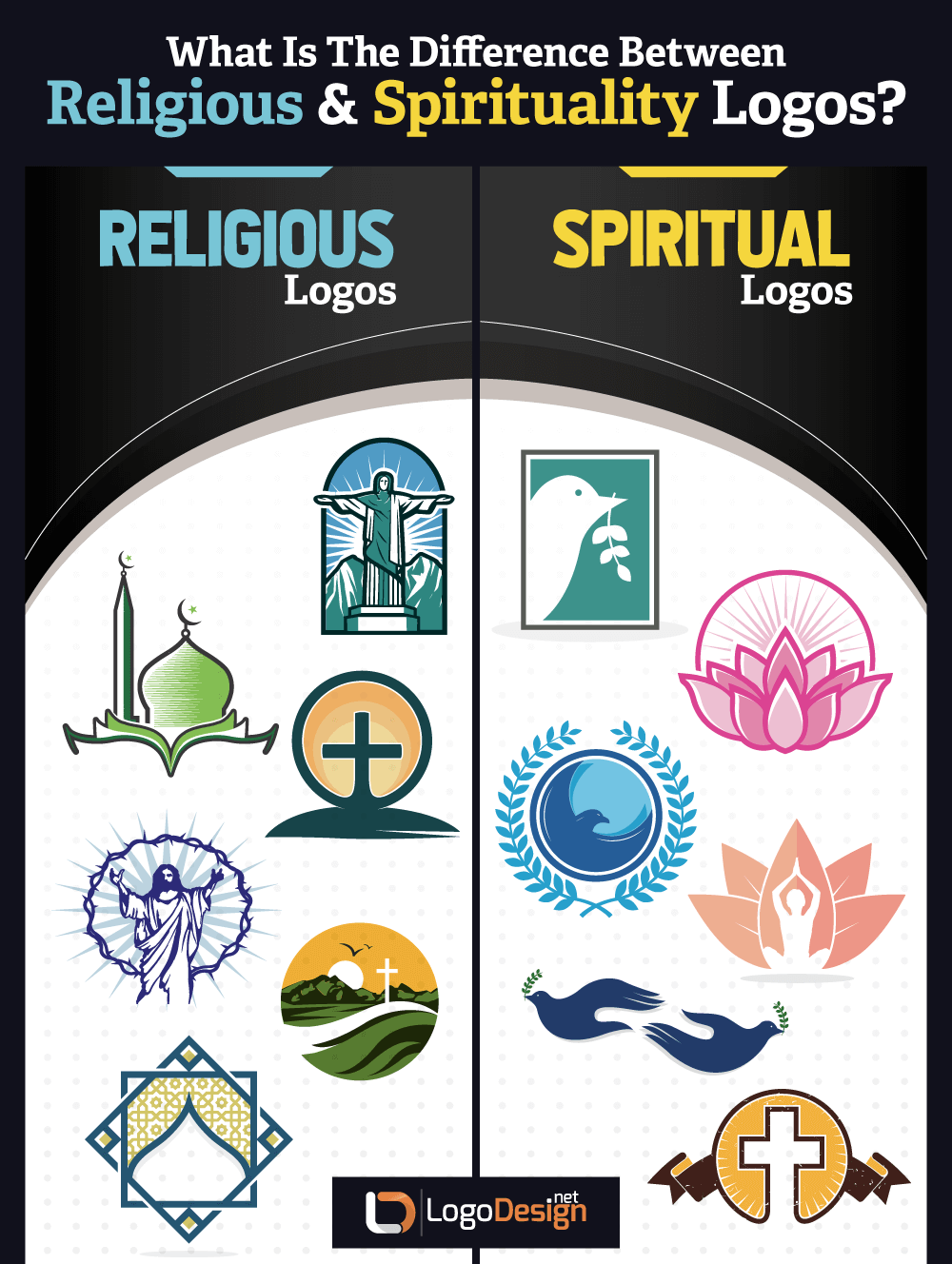
We mentioned some differences previously, especially in the portion on religious symbols and icons. With multiple thousands of religions worldwide, it only makes sense that there will be a variety. For example symbols used to create Jesus logos, mosque logos,Catholic logos, etc.
And some of those are more closely tied to a sense of spirituality rather than a system of religious beliefs.
You can define it in different ways, but for the purposes of design, what it often comes down to is that religion tends to be more organized and centered around traditions and people, whereas spirituality is seen as being more unique to an individual, expressed in a variety of ways, and non-denominational at times. For example spiritual symbols used to design lotus logos, funeral home logos, peace logo, etc.
That’s how you can have a non-religious organization that still focuses on promoting spirituality — but you very rarely have the opposite.
Setting aside more traditional religious concerns, spirituality logos are often needed for designing businesses and organizations brand identities such as yoga center logos, reiki master logos, massage spa logos, general wellness center logos and therapist logos.

This is especially popular for businesses like yoga retreats. These types of organizations will often request a Zen meditation logo or a spiritual healing logo, well illustrating how spirituality is commonly viewed as something separate from religion.

Image Bodhi Tree Logo
On the other hand, this subset or genre of spirituality may be more likely to look for icons and imagery inspired by a different brand of religion, such as a Hindu god logo design or Hindu Om logo or swastika, a pagoda logo, or a mandala design.
Some of the most appealing spirituality logo examples are for spiritual retreats, such as this one for Spirit Quest, which re-imagines a more traditional dove image.

Image Spirit Quest Logo
This one for Arkana Spiritual Center uses some gorgeous blue shades and an intriguing butterfly logo design, as well as a creative font.
Image Arkana Spiritual Center
On the other hand, religious logo designs are more typically geared towards organizations that can be readily identified with a specific religion.
That doesn’t necessarily mean a Christian religion, though those are very common. You might just as easily be asked to design a Buddhist temple logo as to design a “god logo.” Of course, temple logo images may be harder to come by than a religious community center logo design, but remember that research and uniqueness are valuable keys to creating an effective religion logo.
Of course, there is more to this than just creating a “believe” logo for a church. Religious logos may be used in peripheral concerns, too — anything that has to do with religion, like a funeral home logo or a cemetery logo, or a priest logo design. It could even be less directly related to religion than that — depending on who is running a business, they may want their beliefs reflected in the logo, such as in a religious clothing logo including a Jesus fish or something along those lines. Catholic day care center logos tend to use religious-inspired imagery; and some not-for-profit charity center logos or welfare society logos are also created by religious orders.
Image St. Anthony School
This logo for St. John’s Catholic School uses a more unique take on a traditional cross, as well as a dove image.
This logo for Calvary Church is striking in that it has a very unique version of the cross, and uses a limited amount of colors for an arresting visual.
Image St. Cavalry Church
This logo for Community Bible Fellowship is a sterling example of a minimalist church logo.
Ultimately, whether you’re creating a faith based logo of god-fearing highly religious organizations or one that is centered on human spirituality on an individual level, the key is always ensuring that you understand exactly what your client wants, and why.
Take the time to double check your design against the message of the organization. Accurate messaging is important for any arena of creative logo design, but it’s even more so for a brand identity that should be designed to reach to the hearts of those who see it.
Reviewed by Zaheer Dodhia, CEO and Founder LogoDesign.net