How to Creatively Use Alphabets to Create Letter Logos

Letter logos, also called lettermark logos, are basically monograms, but they’re monograms with a purpose: as your wedding logo or company brand, they represent you to the world.

Alphabet letter logos are typically based on the name of the company — if your company is named Swannie’s, your logo may very well incorporate an S.

swan silhouette logo

Source: LogoDesign.Net

It doesn't just have to be a letter S logo, of course. Apart from choosing a typeface that fits your aesthetic and your message and using that specific typeface alone, as the example above shows letter logos have a lot of room for creativity. The letter itself can easily become a logo image, with a little experimentation.

So let's take a look at how single, two, and three letter logos can be put together to give your company a brand ambassador that won’t be forgotten.

Single Letter Logos

So you're creating a single letter logo, and you're not sure about your typography. Is it too much? Is it too little?

Designer Michael Ian Kaye stated, “What a graphic designer tries to do is make sure the typography is emotionally consistent with the brand.” If you keep that as your basic guideline, then there’s lots of room for variation.

One is modifying the letter to look like an image. This has to work on two levels: both as the letter itself, and as a picture, without detracting from the letter. After all, you want to communicate clearly who you are, and if your lettermarks look too much like actual pictures, that can be lost. If your letters are too plain jane, however, they won’t make as much of a visual impact.

So how do you walk that fine line?

As shown before in the example of Swannie’s, designing your letter logo to reflect an image can be done well. This requires some thought to put together a logo that works on more than one level, ie., as a letter.

Take care not to distract too much from the letter to the point that it gets lost in translation. For example a letter o logo looking like a zero. This can be achieved by keeping the number of elements low; or, to put it another way, to keep it simple!

Another method is to look at negative space within the logo. Creating a logo with negative space can allow you to use that space as an image in itself. It can be kept simple, such as a basic shape — within the middle of an A, for instance, using a star shape icon or something similar.

Negative space can also be used to define the letter, which can help it to be used in a shape, such as this shopping bag logo.

letter s logo in form of shopping bag

Source: LogoDesign.Net

Taking a look at the way that the lettermark itself is created can help to make it unique, niche-friendly, and memorable. Your mission statement and the tone of your business should inform the design of the logo, and the services you offer can actually be represented within the logo, such as with this lettermark Z logo for a tech company.

circuit logo

Source: LogoDesign.Net

Of course, if you want to go a more traditional route, single letter logos lend themselves very well to the "monogram" look, such as on a shield or banner. They look dignified and can stand alone, and with careful attention to color and typeface choices, they don’t have to be run of the mill.

letter R logo

Source: LogoDesign.Net

You can also use handwritten fonts to make your logo stand out even more. Sketch out the look that you would like, and work and rework the variations until you’re happy with your hand lettered logo design. You can also work from a preexisting design, adding or taking away lines and features such as serifs to make it your own.

Two Letter Logos

Two letter logos lend themselves to more variations, simply because there is more space to work with. They can share space and lines, and may give double the negative space, allowing you to use it to greater effect.

Merging the letters allows you to share strokes, keeping the size of the logo to a minimum. Remember, the simpler, the better — letting your two letters share a common straight stroke, whether vertical or horizontal, helps you to cut down on the elements within the logo. It can also give your logo a more unified look.

JM Group logo

Source: Behance/Yazan

You can also adapt this method by interlocking the letters, instead of overlapping them. It's easier to do this with letters that have curves, obviously, rather than just straight lines.

Mirroring your letters also contributes to a unified look. This works either with letters that are already mirror images of each other — D and B, for instance, or W and M — or, if you have the same letter multiple times, they can go back to back. Either way, mirroring gives your logo a polished but quirky tone.

Source: Behance/MW Design Studio

Negative space, just as with single letter logos — and with three letter logos, which we'll get to in a minute — can be used to great effect. If the negative space naturally present with one of your letters doesn’t lend itself easily to being used for the second letter, try superimposing extra negative space on top of the letter, as seen in the infographic.

KJ elephant logo

Source: Behance/Nicole Smith

Labyrinth or puzzle logos are adaptable to any letter, and any number of letters. Though they don't necessarily stick to the "keep it simple" rule, the look of them is consistent enough that it's easier for the viewer to focus on the point of the logo, ie., the letter within.

abstract H letter logo

Source: Behance/akhmad

The blog post here has a handy infographic with examples for many of these design ideas, as well as a further breakdown of these styles.

letter logos infographic

Source: 31 Techniques for Two-Letter Logos from CompanyFolders.com

Three Letter Logos

Lettermark logos with three letters are significantly less common than two. That doesn’t mean that there aren’t lots of good options for getting creative with your logo, however!

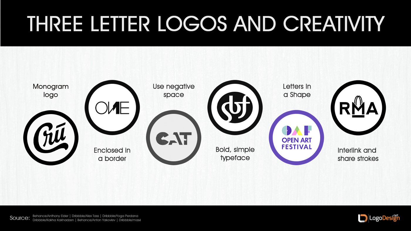
Three letter lettermarks look like more traditional monograms, and so a lot of logos using three letters stick to a real "monogram" look. This can include keeping the same font for each letter, but making the middle letter another third or so bigger than the other two.

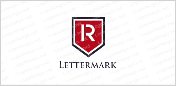
Monograms are often enclosed in a border, sometimes quite an ornate one. This may not be the best choice for a logo, however, since simple is usually better.

Speaking of simple, choosing a basic but bold font can help your logo stand out — picture the HBO logo, for example, which is a very bold block font with a target or camera eye within the negative space of the O.

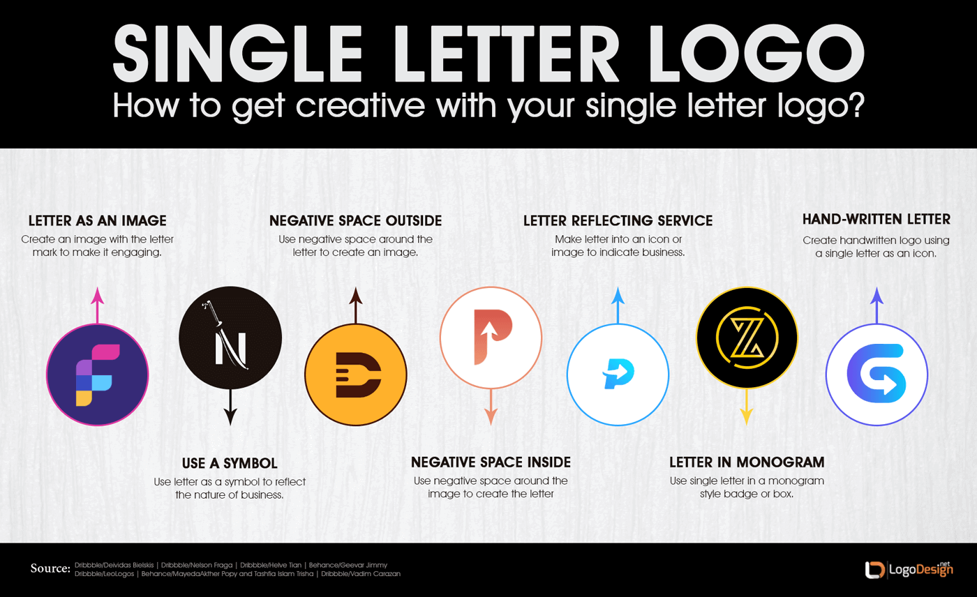
Negative space can also be used with a three letter logo, much as it can with any other number of letters. Again, it may give you more opportunities to either use different elements within the negative space or repeat the same elements, giving you continuity, flow, and unity within your logo.

cow negative space logo

Source: Behance/Branden Bopp

Since three letters give you more opportunity for balance, a popular logo choice is to conform the outer edges of the letters to an overall shape, such as a circle. This gives your logo a sense of completeness.

lab logo

Source: Dribbble/Kasparas Sipavičius

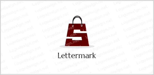
The letters of your logo can also be interlinked and share strokes, just as with the two letter logo. If the letters are too close and don’t stand out, rendering the logo difficult to understand, one solution would be to alter the color of one or two of the letters. Even opting for a different color for just one portion of a letter can be enough to make the individual letters stand out enough for legibility.

Legibility is a big concern no matter how many letters you use, of course. If your viewer can't read the letters in the logo, it's unlikely that they will associate the logo with your company name. So choosing a font or a rendition of a typeface that is user friendly is vital, especially even more so with the more letters that are involved in your logo.

how to create three letter logos

Though lettermark logos may seem simple on the face of it, there is a lot of room for creativity and unique logo design. As with any logo, knowing the tone you want to strike and keeping it viewer friendly is an important part of the process, as is creating something that is easy to process and remember.

Remember, all of the design ideas can be used regardless of how many letters are in your logo, though there may need to be some adaptation. But that's what being creative is all about! If you're creating a lettermark logo, make sure to make it your own.

This article has been reviewed and verified by Zaheer Dodhia, an expert in logo design and branding