
- All
- Accounting & CPA
- Advertising
- Agriculture
- Alphabets
- Animal & Pet
- Apparel & Fashion
- Arts
- Attorney & Law Firm
- Auto & Transportation
- Beauty
- Childcare
- Cleaning
- Communication & Media
- Community & Foundation

Advertising — it’s all about grabbing the attention, right?
It’s about making the viewer sit up and take notice. About encouraging them to take action. About creating something memorable, recognizable, unique.
If you’re an advertising expert, or working with an advertising company to handle their branding, then you know just how important all of that is. At the same time, good advertising starts with the advertising company itself.
After all, if you can’t develop an attention-getting, memorable, recognizable, and unique brand for yourself, how can you convince your clients that you can do the same for them?
Not only do you need a great logo for your business, you also need to showcase your skills.
Let’s take a look at the process behind designing advertising logos, from inspiration to application.


The basics of logo design are the perfect place to start. After all, whether you’re creating a logo for a general advertising company, or whether you need one for a specific niche — a television advertising logo, for example,— the general process boils down to the same steps, often adapted but never forgotten.
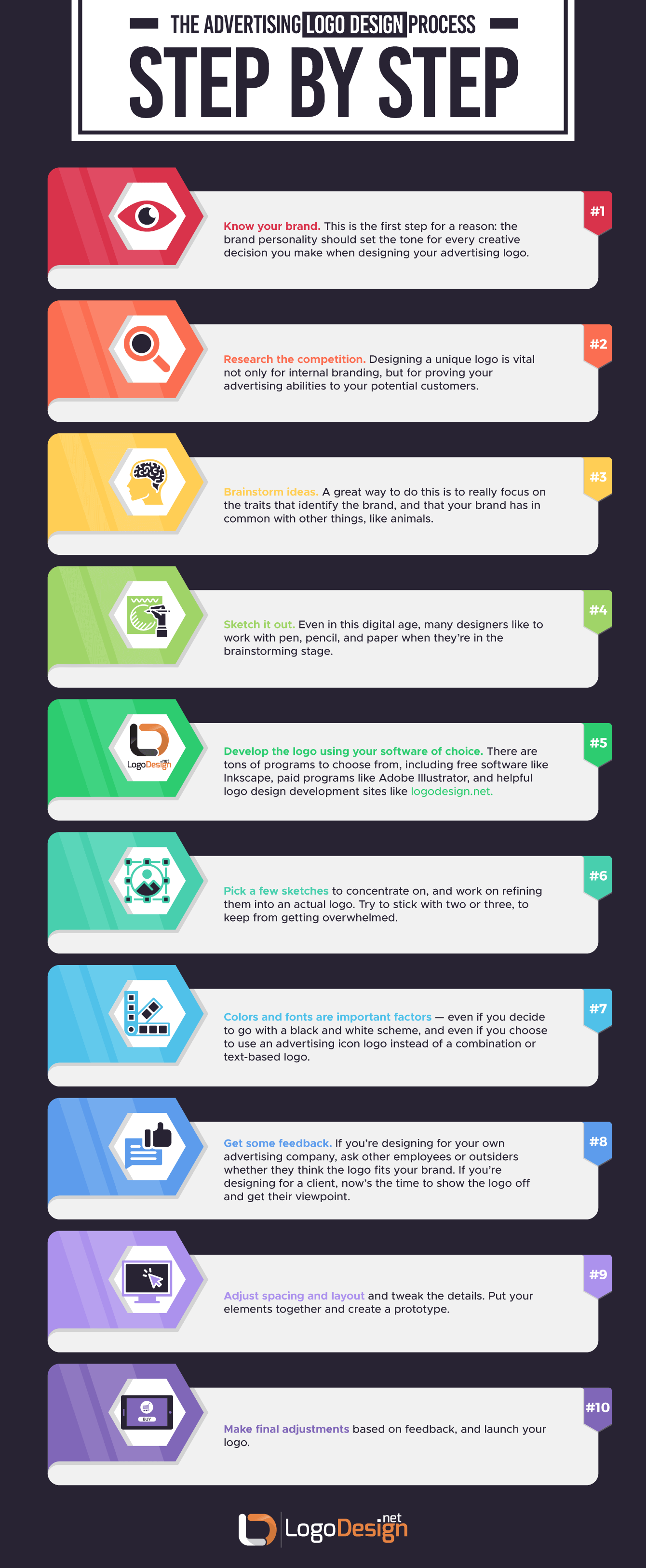
And here they are, in a handy ten-step program for logo development.
Step 1: Know your brand. This is the first step for a reason: the brand personality should set the tone for every creative decision you make when designing your advertising logo.
Step 2: Research the competition. This is important, because creating a unique logo is vital not only for internal branding, but for proving your advertising abilities to your potential customers. You don’t want to end up with a copycat advertising icon, so don’t just type “ads logo png” into Google and then run with it! Take pride in the design process.
Step 3: Brainstorm ideas. A great way to do this is to really focus on the traits that identify the brand, and that your brand has in common with other things, like animals. This is an excellent way to identify a potential “mascot” for your brand. For instance, if your brand is “playful,” a potential mascot could be an otter. It really depends on the specifics of the brand, but that should give you an idea of what to look for. Write down three or four “personality traits” that belong to your brand. What do those personality traits make you think of?
Step 4: Sketch it out. Even in this digital age, many designers like to work with pen, pencil, and paper when they’re in the brainstorming stage. Using the ideas you’ve already noted, fill an entire page with logo ideas. Don’t like any of them enough to develop them further? Fill another page. Give yourself time, and remember to go back to the inspiration behind the brand itself if you feel like you’ve hit a wall. As web designer Dainis Graveris says:
“Sketching helps to evolve your imagination. Once you understand it, you will always start from just white paper.”
Step 5: Pick a few sketches to concentrate on, and work on refining them into an actual logo. For example if you are sketching a logo for a creative director, then narrow down to a few sketches with a variety of concepts like a film production logo, play icon or similar. Try to stick with two or three, to keep from getting overwhelmed. Analyze what you like about them, why they speak to you, and how they relate back to the brand. Are they a good representative of your company?
Step 6: Develop the logo using your software of choice. There are tons of programs to choose from, including free software like Inkscape, paid programs like Adobe Illustrator, and helpful logo design software like logodesign.net. The plus with this last option is that it makes it easier to pinpoint advertising symbols that might commonly be used, if you’re missing anything in your brainstorming session.
Step 7: Choose color and typeface based on your brand. Colors and fonts are important factors — even if you decide to go with a black and white scheme, and even if you choose to use an advertising icon logo instead of a combination or text-based logo. Those are still valid creative decisions that need attention.
Step 8: Adjust spacing and layout and tweak the details. Put your elements together and create a prototype.
Step 9: Get some feedback. If you’re designing for your own advertising company, ask other employees or outsiders whether they think the logo fits your brand. If you’re designing for a client, now’s the time to show the logo off and get their viewpoint.
Step 10: Make final adjustments based on feedback, and launch your logo.
As you go through these steps, remember to keep things as simple as possible. As graphic designer and logo design expert Tyler Littwin says, logo design is ultimately about:
“...Solving for a problem. You're trying to convey something simply that gets across the core tenets of an organization and what that organization does.”
Simplicity is the key.
These ten steps can be followed to design a logo for any market or business. To really up your design game for an advertising logo design, however, it’s smart to take a look at what makes advertising logos unique.
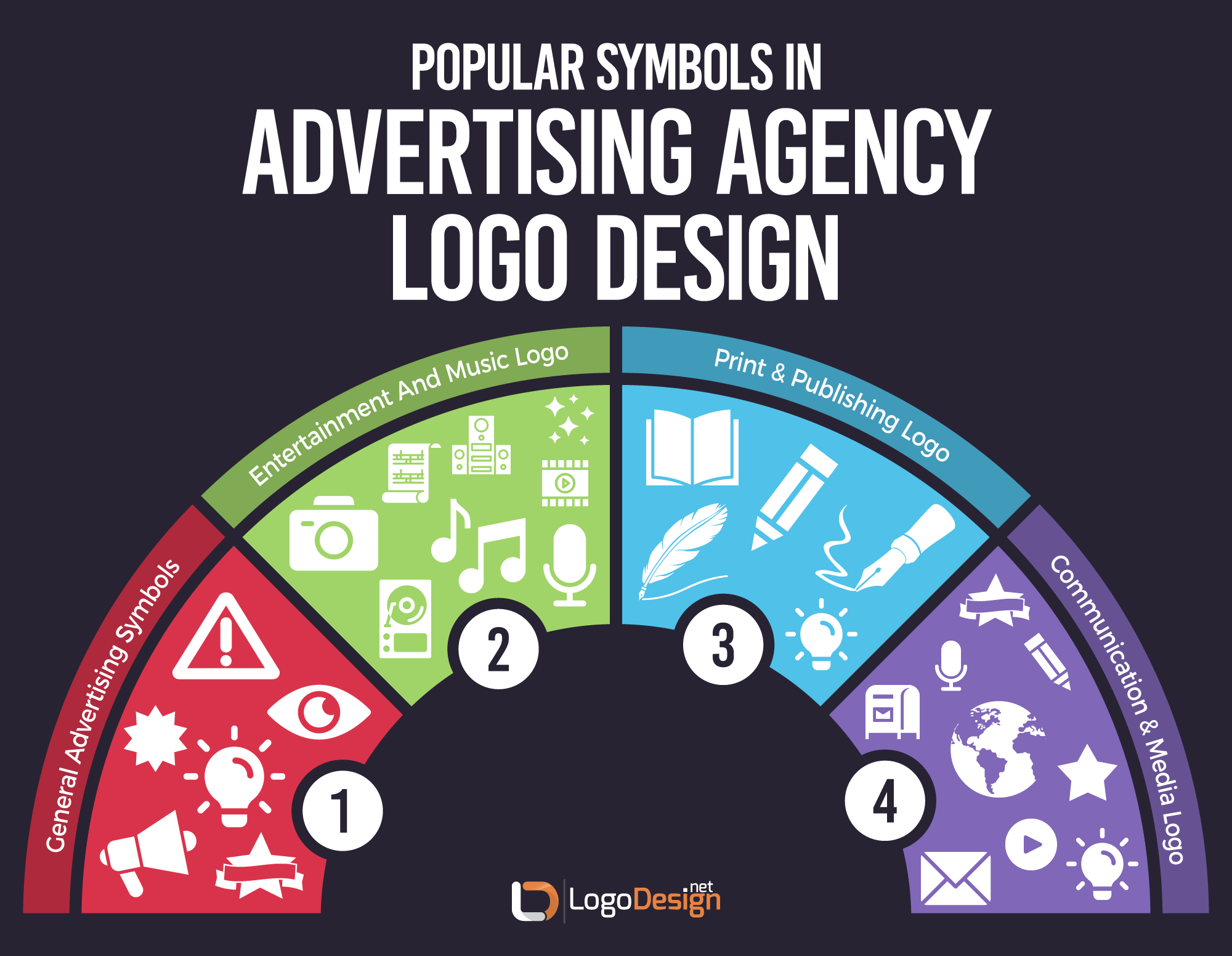
Color, font, shape, spacing, style, logo type — all of these are elements that need consideration for your logo. But what are some classic advertising icons or symbols that you might consider for a logo graphic?
Graphics are often influenced by the market or niche they’re created for. So they usually have some history or inspiration found in that market.
For a traditional advertising logo, this could be something that evokes a “sale” sign, using bright colors to attract attention. But it could also be classic advertising symbols such as:
Anything that makes the viewer think of advertising is fair game for an advertising logo. Choosing an advertising icon that is clearly identified with the business creates a shorthand between your brand and your potential audience. You could use an advertising logo maker for ideas or brainstorm with friends or colleagues.
Advertising symbols work because they link the idea of “getting attention” to a symbol or icon. So, for example, a megaphone icon has a pretty clear connotation.
Other icons, like the starburst or banner, are designed to draw attention to the logo simply by the basic shape. Bulb logos and eye icons are typical attention-getters as well, like the logo for SmartSites.
There are more specific examples, as well, that can be derived from a subset of advertising.
This particular subset is easy to pinpoint examples for. Any advertising symbol that links back to these areas would make a good logo.
Consider these possibilities for inspiration
As is the case with most advertising logo inspirations, it’s really easy to trace ideas for entertainment logos or music video production logos back to a specific reason why they fit the niche well. These ideas don’t take a lot of explanation, which means that the logo design will be easy for your viewer to understand.
A good example is this simple logo design for digital marketing agency Mechanix, which uses simply a stylized computer or TV screen with a cog silhouette.
At the same time, you run a bigger risk of creating a logo that is too generic or which doesn’t stand out. So crafting a great design requires balance and forethought, as well as making sure that you follow through on step nine of the ten-step design process we outlined earlier.

An advertising agency that specializes in books and publishing is going to need a different approach than one which focuses on promoting visual formats. So logos for print media agencies can be both more unique and potentially more cerebral and thoughtful.
If your company focuses on marketing books, your logo likely won’t have as direct an inspiration as other types of advertising logos.
Think about these print-related possibilities:
Advertising symbols for this niche can be a little more difficult to translate into a simple, straightforward iconic logo. Publishing logos for examples will be different from author logos. So it’s good to remember to think outside the box, and look at combining symbols as well.
This logo for marketing company Division of Labor uses a pen nib as well as other elements.
Every time we turn around, it seems as though there’s another source of media or social media platform. Communication, especially in our digital age, is a big deal and a fast-growing market. So there are more advertising companies focused on communication and media advertising than ever before, as well.
Some great communication and media logo inspiration sources for this type of advertising company include:
It’s easy to see how these inspiration ideas could lend themselves to even more specific sub-genres within this type of advertising company. For a news media logo, for example, designers will often use a globe shape in order to reflect a worldwide view or with a combination of TV icons to denote TV broadcast media logos. For digital marketing logo design, drawing on common icons like an envelope or mailbox helps the audience to know what to expect.
Social media company logos, on the other hand, often walk the line between traditional advertising symbols and unique inspiration. YouTube uses a simple play icon; Instagram uses a camera; but Twitter and Snapchat, for example, have highly-unique iconic logos with stories behind them.

The Hub Strategy and Communication Agency, meanwhile, uses a simple star or asterisk-inspired symbol logo, adding in a vintage feel and a rich color palette.

The point is that the symbols draw attention, just like your marketing campaigns will, and reflect the idea of communication.
They’re all good examples of how you can draw on traditional inspiration for your advertising logo, but choose a unique design that makes your company stand out.
It’s probably obvious by now that there is potentially a lot of crossover within advertising niches, as well. Don’t feel that you need to stick to music-related icons just because your advertising business focuses on promoting musicians, for example; the best rock band logos intrigue the audience and make them want to know more about the thought processes behind them. That’s part of what makes a good logo so memorable.
If you’ve spent any time at all in graphic design, you’ll likely have noticed that there are not only major trends, there are also minor trends, sub-trends, market-specific trends, and so on. For example, a few years back minimal graphic designs were an “in” thing, which they still are but not as much. These trends can be helpful, because they’re usually popular for a reason.
On the other hand, you don’t want to just jump on the bandwagon because everyone else is doing it; that’s the shortcut to a copycat logo.
So it’s important not to only look at what the trends are, but why they are, as well.
Let’s analyze some individual elements of good logo design, and what the corresponding trends are in advertising logos.
Color choice is one of those basic fundamentals for any graphic design, but it’s especially important for logo design because your logo needs to pack a punch in such a small area.
Logos are typically shown as only a few inches wide by a few inches high. Not a lot of real estate, which means that colors are unlikely to be overwhelming, but can easily be underutilized.
Choosing your logo color palette is about more than just the colors you happen to like, of course. There’s an entire area of research behind the idea of the psychology of logo color, which is based on how we tend to react to certain colors. Those reactions suggest that certain colors carry inherent traits that influence how we perceive them, and this inherent attribution of traits can be used to your benefit in logo design.
For example, yellow and orange tones communicate warmth, vitality, friendliness, and cheer, and are preferred by advertising and communication companies. Red is bold, dramatic, and can be a warning color. Blue carries the feeling of trust, calmness, and tradition.
Banking on those color psychology tendencies gives you a shorthand to use in communicating with your audience. Choose colors that convey the message you want to send for your brand.
At the same time, advertising is about, well, advertising — so you’ll likely want to use colors that draw the eye and get attention. There’s a reason why warm colors, especially yellow and orange, are frequently used within call to action buttons in website design — they grab attention, and are more likely to incite the viewer to action.
If that’s a valuable lesson for you as an advertising specialist, it’s also a valuable lesson for your branding and logo design.
A quick perusal of some of the top advertising companies will reveal what you may have already expected: advertising company logos often practice what they preach, and use bright colors that draw the eye. The logo for the marketing company Manifesto is a great example of that, using a warm orange that isn’t too harsh but still catches attention.
At the same time, these bright pops of color are frequently paired with dramatically different backdrops, such as dark gray or black, to make them stand out even more. The logo here for Trainha Design illustrates how well this can work.
This makes perfect sense for an advertising logo. Choose a color that draws the eye and captures the attention, and you’ve already demonstrated your advertising and marketing skills to the viewer.
Some suggestions of color choices for advertising logos, based on trends and via Pantone:
Yellows: 7405 C
7548 C
Oranges: 4012 C
Orange O21 C
Reds: Warm red
173 C
You can also use tools like Paletton to help you put together a warm-color-inspired color palette for your logo.
It probably won’t surprise you to learn that fonts, too, carry inherent traits and are the subject of the “psychology of fonts,” just like colors.
Fonts may be a little bit trickier, however. It’s easier to relate or identify with a color than it is with a typeface. We tend to think of fonts as just being utilitarian: their only job is to be legible, and beyond that, does it really matter?
Well, yes, it does, as a matter of fact. Certain fonts are more apt to be paid attention to, for one thing. A heavy, bold font is likely to draw the eye, whereas a light, thin font may easily be ignored. Script fonts are also less likely to keep attention — we like fonts that are easy to read, right off the bat.
Here is a very basic breakdown of the three major font types and what they evoke:
Again, the choice you make will depend heavily on the brand personality that you are trying to promote. Is your advertising company a straightforward, traditional heavy-hitter? Think about a serif font. Is it a creative, quirky, out-of-the-box-thinker? Consider a script font.
The most important thing in choosing a font is to ensure that it is user-friendly, and make your text logo design readable. Don’t opt for a font so far off the beaten path that it renders your logo impossible to read. Memorability = usability.
Again turning to a list of the top advertising agencies, it’s plain to see that the majority of font-based or combination logos use sans-serif typefaces that are blunt, easy to read, and impossible to mistake for anything else.
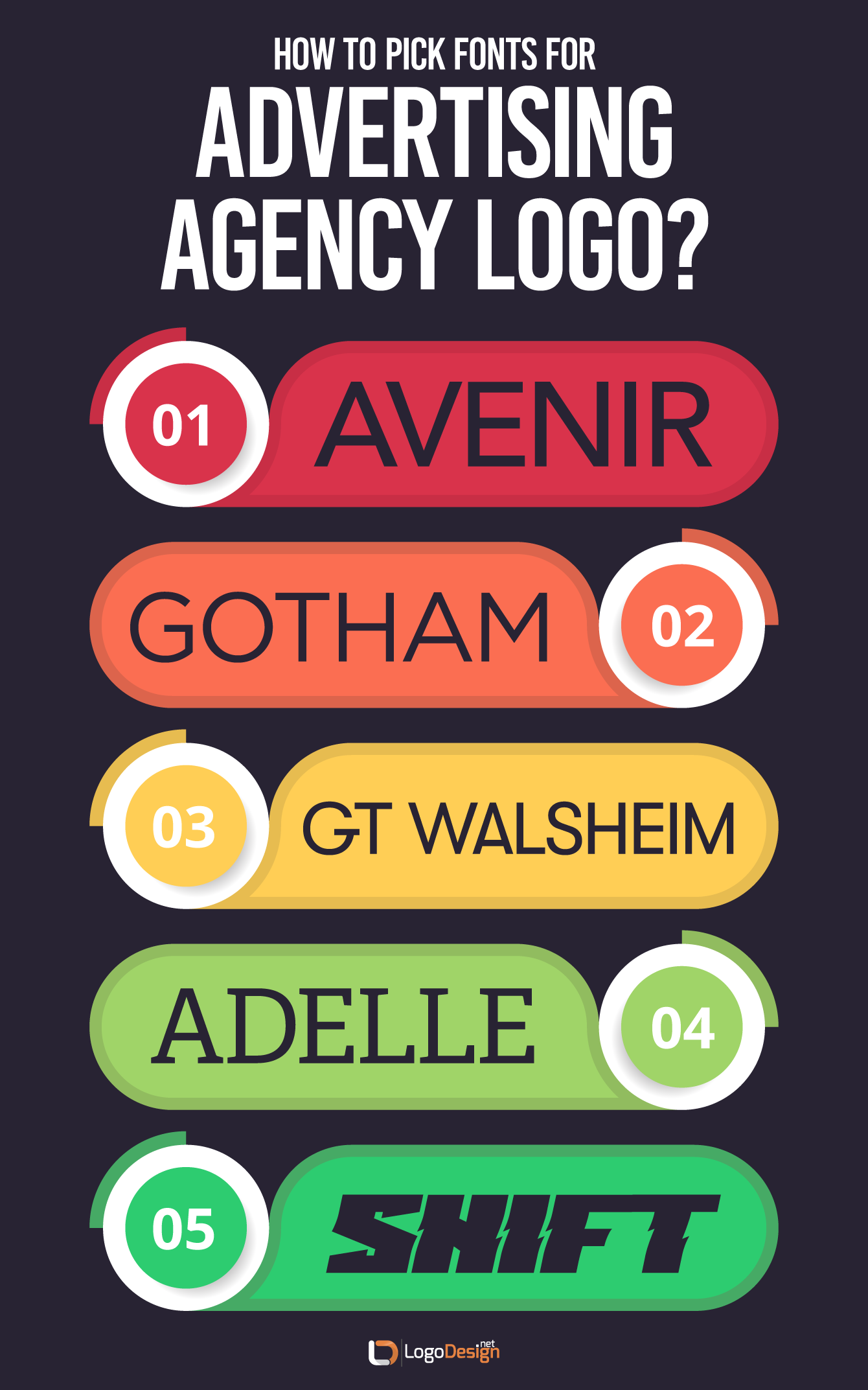
In this way, the best fonts for advertising logos often follow the trends set by advertisements themselves. So the top fonts for your marketing materials, such as the twenty-five laid out here by MDirector Digital Marketing, could be good choices for your logo as well.
Of course, that doesn’t mean that you need to follow this trend — several of the most appealing logos use quirky, bespoke variants on serifs or scripts, and some don’t use a typeface at all. But it’s easy to understand why the trend is towards sans-serif in this arena: it gets the job done, ensures legibility, and lets you know that the company is serious about what it does.
Some font suggestions for advertising logos, based on trends:
You can find more font suggestions, many of them specifically based on digital marketing and creativity, on Type Wolf.
Along with the color and font choice, there’s another heavy-hitter to consider: what type of logo are you going to design to begin with?
You have some options:
Within these basic logo types, there are a lot of smaller subsets that include different details and creative decisions. Each of them deserve consideration, but some lend themselves more easily to an advertising logo.
Let’s take a look at these, and why.
In our research, the overwhelming majority of advertising logos have been font-based, such as lettermarks, wordmarks, and monograms.
This doesn’t mean that the logos are always simply the name of the advertising company alone — but many of them use unique fonts in conjunction with carefully-selected color palettes to create logos that pack a punch in a small space, and with few elements.
Font-based logos are often seen as dignified and trustworthy. In addition, many advertising firms have longer names, with multiple words — a monogram or lettermark logo shortens that up, making it an effective logo choice, as seen here.
Probably the second most common logotype is a combination logo. For instance, an entertainment and music logo design might use a film reel icon and their name as their combination wordmark. A communication and media marketing company might use a satellite logo and a monogram.
Combination logos have the advantage of being more versatile. Depending on the branding, you could choose to use both parts of the combination mark, or just the typeface, or just the icon. Whatever the case, your logo is already established, so the individual components are just as recognizable on their own.
The simple combination logo for advertising and marketing firm Weber Shandwick is a great example of how well this works.
Combination marks are also excellent for a new company, allowing them to get their name out there along with an icon or symbol. Later on, once the reputation is in place, they might choose to drop the typeface portion of the logo and simply use the icon or symbol.
Branding pioneer and unarguable expert Walter Landor famously said,
“Products are made in the factory, but brands are created in the mind.”
Branding is so tied into reputation, into what the customers think about the company, that the truth of that statement is obvious.
Whether you have a new company or an established name, branding is everything for company growth! That’s because your brand is about more than just the visual components — it’s about how your audience views you, your reputation, and how you interact with others.
But the visual component, admittedly, is what most people think of when they consider branding.
Your logo is probably the first and foremost example of your branding. It’ll be the most commonly-seen visual representation of your brand, and it will act as a shorthand to connect with your customers. When they see your logo, they will think of your brand as a whole, and react accordingly.
For this reason, it’s hard to overuse a good logo. Your logo should be used in your website design — on every page, in fact — in your paper and print marketing, on your social media accounts, in your emails, on your business cards and promotional items — your logo is like a signature. It’s what stamps a product as belonging to your brand.
And remember, proving that you can effectively brand a product is some of the best PR you can get, as an advertising company! So don’t leave your audience in doubt. Brand everything.
Here are some of the best examples of advertising logos — you might even call them logos for advertising icons!
REQ. This marketing company’s logo is a stellar example of how to use a simple, stripped-down design that still packs a punch. With a dark background, the basic red type of the wordmark logo really stands out.
Spire Agency. This logo uses the imagery of a pencil — or a spire, depending on how you look at it — as a takeoff-ready wordmark, with a deep red background to make the white text pop.
Moburst. This logo uses a simple combination mark, with a colorful symbol and a modern sans-serif font on a white background.
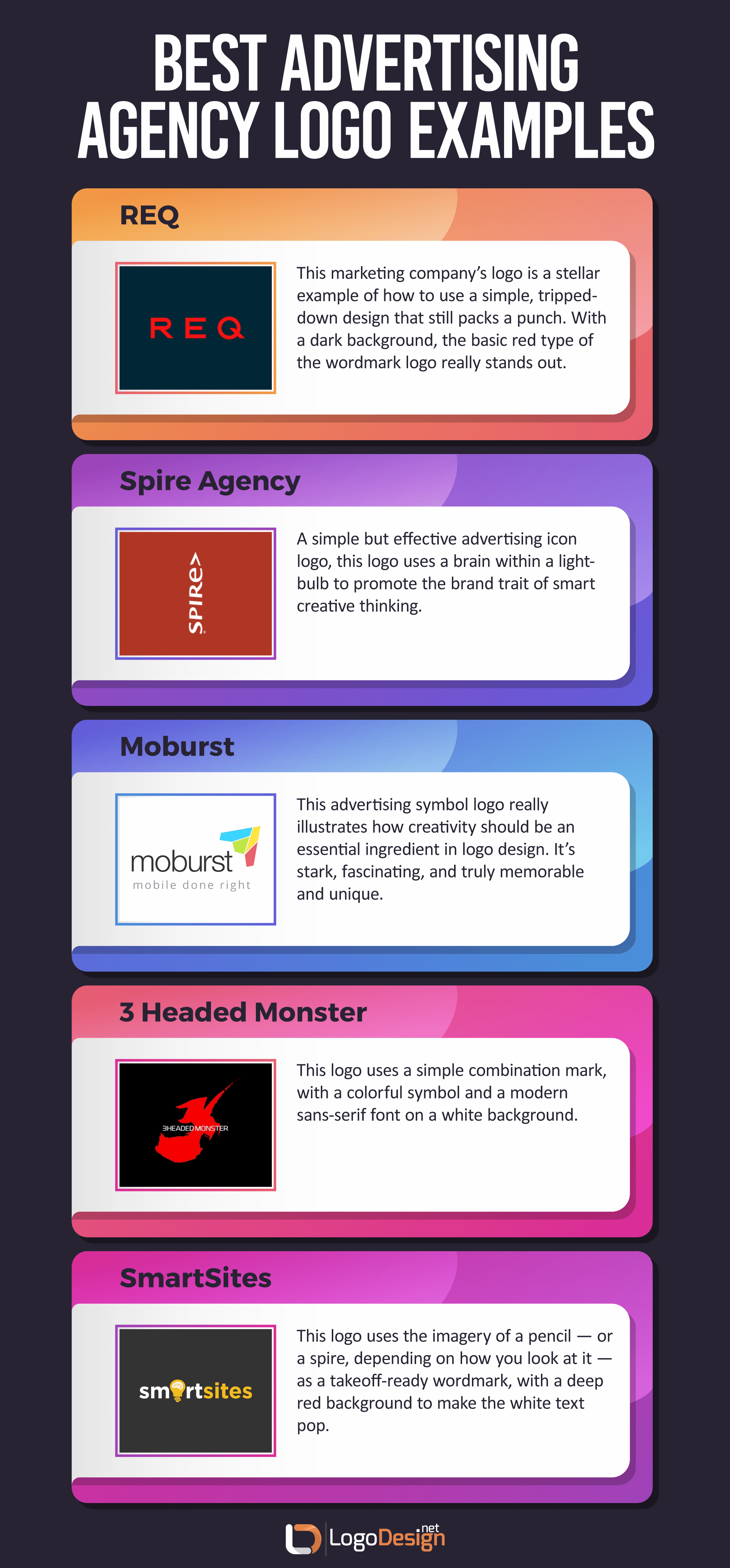
SmartSites. A simple but effective advertising icon logo, this logo uses a brain within a lightbulb to promote the brand trait of smart creative thinking.

3 Headed Monster. This advertising symbol logo really illustrates how creativity should be an essential ingredient in logo design. It’s stark, fascinating, and truly memorable and unique.

To create the ultimate advertising logo that is the perfect fit for your company, remember to follow the ten steps we outlined above. On top of that, research the trends for your specific company niche, and understand why they’re popular. Take the time to look at the psychologies of color and font, specifically, and don’t forget to look at effective existing logos for some inspiration. Think about what you like about them, and why.
The best logo for an advertising company should be memorable, unique, and effective. It should showcase your skills at grabbing attention — and keeping it. It should send the right message, reflect your brand personality, and stand the test of time.
In short, a great advertising logo has a heavy weight on its shoulders!
But by following the plan outlined here, the greatest advertising logo can be yours.
Written by Zaheer Dodhia, CEO and Founder of LogoDesign.net