How to Master Bezier Curves to Vectorize Your Logotype Using the Box Method

Bezier curves are probably the most popular method of creating logotypes for computer animation and illustration. Chances are, a lot of the typefaces you see in corporate logos are created by utilizing one of the two Bezier curve types: cubic or quadric. While we’ll talk about these later, this tutorial is based on the cubic curve type.

Using Adobe Illustrator 2020, we’ll show you how to use Bezier curves to vectorize your logotype with the box method. We’ll also take a look at some of the cool tips that'll help you master this technique, and talk about how Bezier curves came about.

It's going to be a very informative topic, so stick around.

Let's start with a video tutorial (below) and a step-by-step tutorial in written format.

In today's tutorial, we're going to focus on emotion and symbolism and how to tie the two together with simple tweaks, using the concept of pareidolia and emotion intertwined.

The Tutorial

1. The logotype that I’m going to use today is based on some hand-lettering that I did earlier. To use it for this video, I scanned the file and then transferred it to my Illustrator. But don’t worry if you don’t have a scanner. Simply take a nice and clear picture of your lettering and import it to your computer. Just remember the clearer the picture, the sharper your vector. If you have used any guides around the letters, include them in your picture as it’ll help when you start vectoring it.


2. Now let’s start. Click on the Direct Selection tool to see the several anchor points that are going all around the letter shapes. The placement of these anchor points is achieved a certain way: all horizontal and vertical, aside from those few little points on the corners of 'C' and 'A', etc. Take a closer look at the anchor points to appreciate the symmetry in the way anchor points completely cover each letter.


If it makes you think, "How does the designer know where to put the anchor points to achieve a certain shape?" That’s what I’m going to show you today.

3. First, open a new document file. I’ll open an A4 simply because I feel comfortable with it. You can choose anyone that you like.

4. Now, create a group of layers in the document. I have named one layer 'Template' and the other ‘Vector’. We’ll work on the vector layer today. The purpose of the multiple layers is to have a backup ready if you want to go a few steps back in your process. It’s easier and more efficient than ‘undoing’ the many steps.

5. Bring down the opacity of the logotype image to about 10% to make the boundaries of the shape look sharper and clearer. The purpose behind sharper boundaries is less artistic and more practical: we want to be able to easily see where we put our dots and lines.

6. Now comes the box method. Before we start with the method, it's important, for those of you who don’t know it, to become familiarized with it.

What is the Box Method?

The box method is the theory behind vector art that’s created using Bezier paths. Whenever you make a shape in Illustrator that’s curvy or circular, the program gives you anchor points and handles (Bezier paths). These anchor points are the borders around the shape.


To see it in action, create a circle on your screen and switch on the Outline mode. When you highlight it, you can see that there's a box around the circle. Now look closely. Everywhere the box touches the outline of the circle, that’s the most extreme curve, the outermost path of the circle. And that's where the anchor point is going to be.

In our circle, there are going to be four anchor points as there are four points where the box/border hits the circle’s boundary line.

The goal of anchor points placement (or Pen-tooling, as some people like to call it) is to have correct borders and handle placements to guide the modifications in the shape.

What the box method does is, it retains your circle in a very uniform and scalable condition. Using the handles on either side of the anchor points, you can manipulate your circle to go or take weird shapes in any which way you want, without messing up the integrity of the borders. The box will resize itself to become the perfect container for any modification you do to your circle.

As you can see, it is a highly useful method when creating vector art. It adds scalability to your designs. It allows you to resize your shape, and go up and down as per your needs without harming the design quality.

Coming Back to The Tutorial

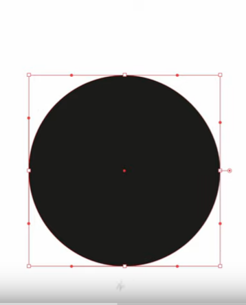
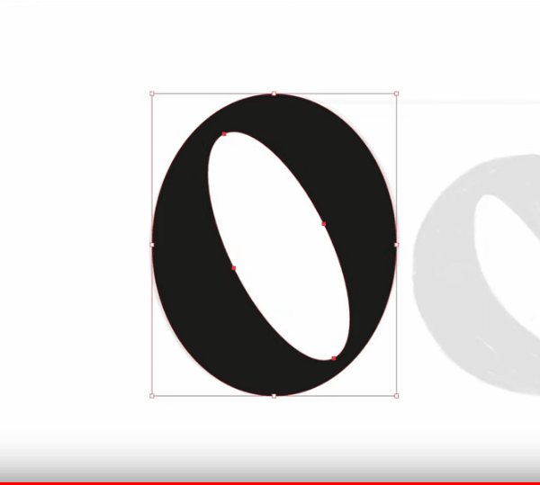
7. Now that you understand the box method, let's see how it helps in real design situations. Let’s start with the first letter of the logotype: ‘O’. While you can easily create this shape by using a circle and manipulating it, it won’t work in all situations. Therefore, I’m going to show you how to do it properly, using Bezier curves.

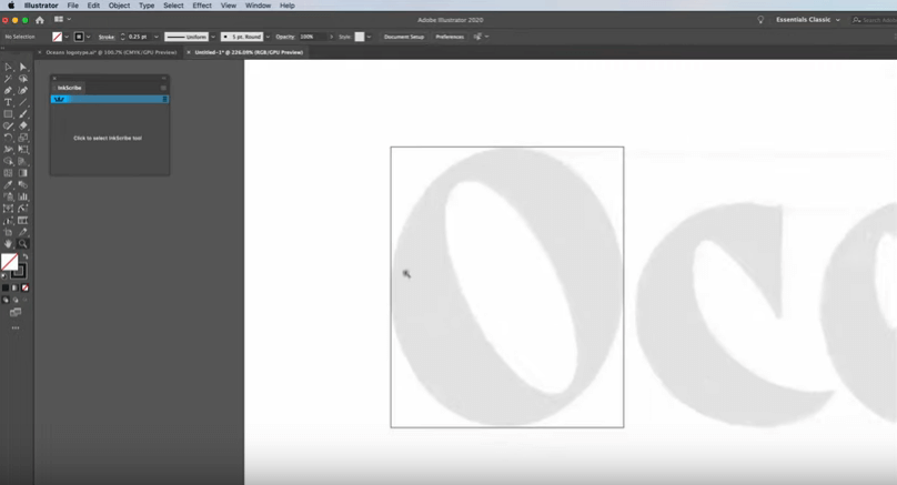
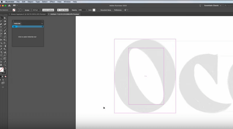
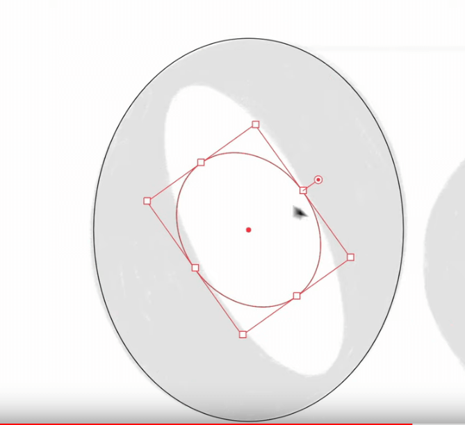
8. To do it, first create a guide around the letter. So go ahead and create a filter stroke and then create a square, a box around the letter. Then reduce the stroke size to 0.25pt.

9. Start manipulating the box to make sure that it contains the letter O perfectly. When resizing the box, make sure that every time it hits the boundary line of the circle, you stop. Do it on all four sides of the box.


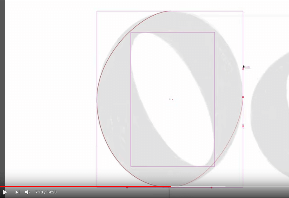
10. Do you see the points where the circle is meeting the square? Those are going to be our anchor points. Now repeat this process for the oval shape within the circle. Highlight the square, press Ctrl+C (for Mac users Command+C) and then Ctrl+F (Command+F) and start working: drag and drop. Make sure the inner square tightly contains the oval within. Everywhere it touches the oval, that’s our anchor point. So in total, now we have eight anchor points. 4 for the circle and 4 for the oval.


11. Highlight the whole letter now containing both boxes and press Ctrl+5 (Command+5). This will create guides that you can switch on or off.

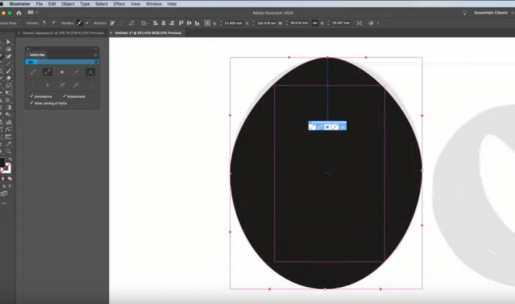
12. All we need to do now is, place the anchor points where needed and pull the handles in a way that gives us the shape that we need. If it sounds simple, it’s not. You’ll have to practice a lot to master it. Now, working with the shape, I don’t use the Pen tool. I use something called InkScribe. It’s a plugin from AstituteGraphics that makes it easier to use the Pen tool. But if you rather use your regular Pen tool, that’s fine. The process is the same.

13. Ok, now turn on the Smart Guides. Use Ctrl+U (Command+U) or go over to the View tab and from the dropdown menu, switch on the Smart Guides.

14. Go on the top of the shape of the outer box and click on the exact point where the box is touching the boundary of O. As soon as you do it, an anchor point will appear with two handles on either side of it. These handles are movable and allow you to manipulate the shape. Now be careful. Make sure your handles are perfectly aligned to the horizontal line of the top of the box. Hold ‘Shift’ when you do it otherwise the handles can go anywhere.

15. Now come on to the left side of the box. You’ll see a curve – in the shape of a rubber band – stretching from the top anchor point. Connect it to the one on the left side of the box, then the one on the bottom, then the right side one, and neatly bring it back to the top – completing the circle.


16. Again, make sure the handles are vertical on vertical lines and horizontal on horizontal lines.

17. To see how the shape looks, switch from Stroke to Fill and you’ll see that the shape is not exactly true. It looks like a weird egg instead of the stylized O that we want.


18. But we can correct that by dragging the handles. While working on the handles, keep in mind that none of the handles can intersect the opposite line – it’ll mess up the shape. Work with two opposing handles of two different anchor points simultaneously to work the shape into something that you want, instead of focusing on one handle.

19. Click on the top-left handle, press Shift and drag the handle till it is right over the shape boundary.

20. Now repeat the process for everywhere on the shape where you want to tweak the boundary a little bit, make it smoother, more organic.

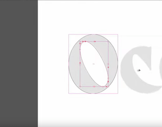
21. Plot the anchor points for the inner shape too: the oval. Work the handles and bring the outline to fit the shape perfectly. Tweak it as you go to make it look perfect.


22. And there you have it, a perfectly shaped and vectored O. But it’s not the O that we want; the inner oval hasn’t been cut out and so it still looks more like a circle than a letter. So what do we do? We highlight the whole shape, including the inner oval, then press Shift+M to cut out the oval with the Shape Builder tool, giving us our perfect O.


23. Continue the process of plotting anchor points on the remaining letters of the logotype till you’ve achieved a perfect shape for each letter. Now that you know the mechanics of Bezier curve paths, it’ll be cool to know that there’s a shortcut method to create shapes for letters. It’s done by embossing a circle on letter O and then simply moving and resizing the circle till it fits the shape. Have a look at the video at 9:41 and see what I mean.


With both these methods – using Bezier curve anchor points and the shortcut of embossing the shapes – we achieve the same results. With curves, though, you get more knowledge and freedom to flex your creative muscle and work on more complicated shapes with better precision and control.

Why Bezier Curves? A History


The Bezier curve is based on an old mathematical phenomenon – the Bernstein polynomials – and was properly developed and popularized by Pierre Bezier. He was a French engineer and in the 1960s, while working on the bodywork of Renault cars that’ll make the car more fuel-efficient, came up with the concept of this curve and then got it patented.

The interesting thing is, these curves had already been developed by another French physicist and mathematician, Paul de Casteljau, in 1959 – a year earlier than Bezier. He developed these curves while working at Citroën, another automaker.

But if he developed the curves before Bezier did, how come they are not named after him? Why do we call them the Bezier curves instead of Casteljau curves? Is it a tale of stolen genius, do we start hating Bezier?

No. They are named after Bezier because Citroën didn’t allow Casteljau to publish his findings and patent them. A year later, when Bezier arrived at the idea of these curves independently, Renault was more than happy to let him publish his findings and in turn be associated with a famous, ground-breaking engineer.

The Bezier curves are now regularly used in a variety of computer animation programs and applications, including computer fonts.

What are the Different Types of Bezier Curves?

The mathematics behind Bezier curves give us three different types of these curves. Their distinction depends upon how many anchor points and handles (control points) you want in the curve or the curve gives you. So basically, there are three kinds of Bezier curves that you can employ in your animations or font types. A title and description of each is given below:

Linear Bezier Curves


The linear Bezier curve gives you two handles but no anchor point, so essentially, a linear curve gives you a straight, linear line.

Quadratic Bezier Curves

With quadratic Bezier curves, you get two anchor points and one control point. The TrueType computer fonts use quadratic Bezier curves in their construction.

Cubic Bezier Curves

Cubic Bezier curves are the most popular and most frequently used. Its distinct structure makes it the most appropriate base to create PostScript fonts in computer systems. It is also the most flexible and modifiable with two control points and two anchor points, allowing you to create more complicated shapes with relatively easier and higher accuracy and sharpness.

Some Cool Tips toMaster Bezier Curves

  • To achieve super-smooth curves, always choose the outermost anchor point on each curve as you begin designing and keep those handles close in length at each point.
  • If a curve isn't working as you had wanted, try changing the placement of the anchor point and see if that improves the matter.
  • To get to the finer details, don't be afraid to zoom in.
  • Cubic curve, used in this example as well as most other logotype designs, is the most economical. Because it contains more anchor points than quadratic curves, you can create far more complicated shapes with a fewer number of control points. For example: to create a circle, the cubic Bezier curve uses four anchor points with two handles on each point (12 points in total), while a quadratic Bezier curve uses 8 anchor points and 8 control points (16 points in total) adding substantially to the file size. Cubic curves produce a smaller file size without hurting the image sharpness.

Ready to Fiddle with the Curves Yourself?

Graphic design professionals and Bezier curves are in a lifelong relationship. Across the board application of these beautiful curves demands that any graphic designer, serious about their profession, not only must know how to achieve perfect Beziers but understands the concept and methodology behind it, too.

I hope that this article has helped you achieve both. Through the knowledge and the practical examples shared here, hopefully you can understand the artistry behind the mathematics of Bezier curves. As you practice more, you’ll be able to master it more. Wishing you all the best, and if you have any comments or questions, that’s what the comment section is for; let’s connect.

See you next time.

Credits:

Written by Zaheer Dodhia, CEO and Founder LogoDesign.net.

Video by Will Paterson, Designer, and Vblogger, WillPaterson.Design