Step-By-Step Tutorial
This is a comprehensive tutorial of the above video in the written format for a step-by-step guide.
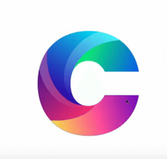
1. Choose a new document in your Adobe Illustrator and type the letter C. I’m using the letter C but you can use any other circular letter. The reason we’re using a circular letter is that I want to work with curves in today’s tutorial and show you how you can segment your curves, add different gradients into different segments and even add highlights. So choose C or any other round letter, it’s up to you.
2. In the next step, we will choose a typeface for the letter C logo. Pick one that’ll be thick and uniform on all sides because you don’t want to be restricted by the shape of your font. So the one I’m going to choose is a Google font called Poppins and I’ll select Poppins Black.
3. Zoom in a little so the letter is big enough for you to work easily. Now, highlight the whole letter and press right-click. You’ll see that the letter already looks a little different just by this simple change. Why it looks different is because by pressing the right-click of your mouse, you have created outlines of the letter. Meaning, it’s no longer a letter or editable text; it's a vector now and the Illustrator has presented the shape to you in its vector format. Hence, the outlines.
Now comes segmenting. In this step, we will divide the shape into segments using Bezier curves for the logo, which will give us four separate sections within the same shape. We will do that in a way that maintains the integrity of the letter C but will make the design that much better and more sophisticated looking.
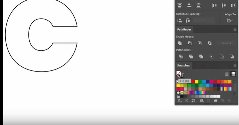
4. Start by highlighting the letter C and then choosing the Stroke option so your fill is empty and all you can see is the stroke of the shape. You can achieve this by simply switching from the Fill to the Stroke button, like in the screenshot below, or by pressing Shift+X (Command+ X for Mac).
5. As you can see, the simple command has removed the fill and given us the curve of the logo on which we’ll work. We will now start the process of adding segments into the logo using Bezier curves.
Insider tip: I have recently done another tutorial video on Bezier curves. If you are at all interested and want to master this beautiful concept, you can learn from the tutorial video. But for now, we bring our focus back to the letter C logo creation.
Insider tip: I have recently done another tutorial video on Bezier curves. If you are at all interested and want to master this beautiful concept, you can learn from the tutorial video. But for now, we bring our focus back to the letter C logo creation.
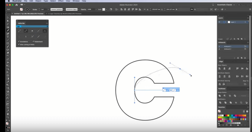
6. We will use the Pen Tool to make the curves. Well, not actually the Pen tool. My weapon of choice is InkScribe, a handy plugin from Astute Graphics that improves pen tooling by a wide margin. It helps you plot out your vector points more easily and smoothly.
7. Your InkScribe ready, go on to the View tab and turn on Smart Guides. The Guides help you hit the exact spots that you need in order to add precision to your design.
8. Now start plotting. Get inside the letter C and plot an anchor point there in the middle of the inside wall. As soon as you click that spot, a thread (actually a curve) will extend from the point, allowing you to take it anywhere you want. Where you place it, that’ll be your first segment.
Move the thread as per your need to determine the best place from where to cut the logo into the first segment. Don’t worry if you have placed it anywhere differently than you wanted. The curve allows you to tweak and twist it an unlimited number of times. Just make sure that you take the curve and drop its other end outside the stroke of the letter. This is you telling the Illustrator that this part needs to become separated.
9. It will look something like this:
10. When you want to see how exactly the curve looks, press Ctrl + Y (Command+Y) and it’ll take you to the Outline mode. The Outline Mode will enable you to see how the curve has been clearly defined.
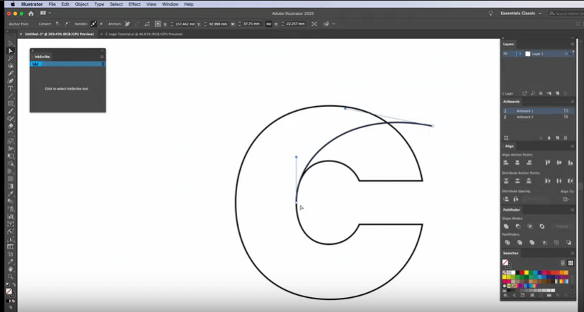
11. Now create another curve. Click on another anchor point. But this time, plot it a little bit behind the plot point of the first curve so the segments look natural and organic. As in the previous step, play around with the curve placement until you’re happy with how it lies with the overall shape.
When working with Bezier curves, there’s a rule of thumb you need to know. The end of the curve inside the shape should merge with the boundary line whereas the end that’s going outside the boundary should intersect it (if you want to create separate parts within a shape using the curve) and go a little way beyond it.
12. The second segment done, we are on the last one now. It’ll be quite close to the base of the shape, like in the screenshot below:
13. The next step consists of adding color to the logo but before we do that, we have to make sure that our C has correctly been segmented. To find out, highlight the letter and go to the Shape Builder tool. Now click and drag each segment apart to see if it detaches from the letter. One of my segments isn’t doing so. If you are facing the same problem, there’s an easy remedy. If the outside extension of the curve is well beyond the boundary line, then there’s something wrong with the inside end of the curve merging with the letter boundary. Try extending it a bit and see the problem disappear.
14. Check for separate segments now. All working? Great. Get rid of the outside lines now. Press Alt (Option) and you’ll see a tiny plus and minus sign appearing alternatively beneath the cursor. Hold Alt and drag your cursor over these outside lines and see them vanish one by one. Now press Shift+X (same for Mac) and the system will switch from the Stroke to the Fill. The logo shape filled, take a closer look at each angle and correct any flaws you find.
You must do it now because the next step is coloring. If there are any flaws in the design that are left, they’ll be carried along in the subsequent steps, making it much harder to fix them later.
15. All miscellaneous errors fixed? On to the coloring now. But let’s just quickly duplicate this shape here right now (as a contingency plan) so if you decide to make any changes to the curves later, you won’t have to start from scratch or look through the history to arrive at the right step; you’ll have the logo shape ready.
Regarding the color gradients, I have created all the gradient swatches that I’m going to use. There is a total of five. If you like these gradients and want to use them, look in the description of the video for the link of the place where I’ve put them. All you have to do is put them inside your illustrator before you start this step.
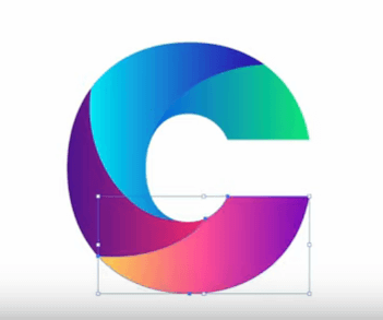
16. Let’s start coloring. Add your gradient swatches to your Swatches panel for easy access. Now choose a gradient swatch for your first segment and drop it there using your eye-dropper tool. I’ve chosen a green-blue gradient for the first section of the logo. For the next segment, I’m choosing dark and light blue; for the third segment, purple-pink, and the last one, peach-light purple.
17. You can change the fill of your gradient and or how it flows from one shade/hue to the other with the help of the Gradient tool. Place it where you want the color change to take place and move it as per your need. I want the green to be at the lower intersection of the two curves so I’m dragging the tool to that side. In the next one, I take the dark blue to the lower end of the curve. I intend to keep the larger curve areas filled with bright gradients while the narrow corners and intersections will have darker shades of the gradient. Do the same thing to the other two sections, and your color fill is done.
But the logo is still not complete. What about some highlights? Highlighting will add further shine to the logo which I think this particular design can take and truly own.
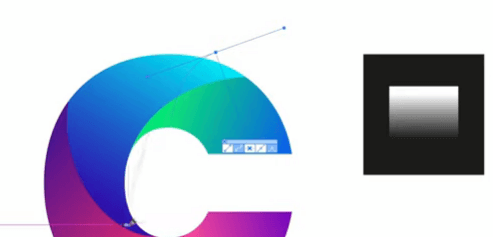
18. To create the highlight, you have to create another gradient. We start by moving outside the artwork, and on this grey area right next to it. Pick the black-white gradient swatch from your Swatches panel and place it there. Open the Gradient window by clicking on the Window menu tab and select the Gradient panel. On the gradient panel, you’ll see a color bar containing the range of your gradient. Click on the black end of the bar and pick white from the color menu that appears. Now you have a range of all white on your bar. But we don’t want all white; we want black and white. So what are we going to do? We’ll click on the little left stub on the bar and change its opacity to zero. Why? Because this way we get a gradient opacity which, depending which way we move, can fade in and out. In today’s logo tutorial, we’ll be using the highlight to fade out.
19. To access your highlight gradient easily, pick a black swatch from your Swatches panel and place it near your logo, then drop the gradient swatch (in a smaller size) over it.
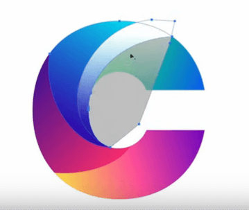
20. We'll be using the Shape Builder tool to create the highlights. The first highlight will be created in the second segment. So click on your gradient swatch on the spot from where you want to pick the color – Illustrator will remember your selection – and start creating your highlight with the pen tool. Turn the smart guides on, go to your pen tool and click on top of the second segment, right over from where you want the highlight to start.
Bring the curve down to where the blue is almost meeting the yellow and drop the curve. Now bring the thread up and connect it to the starting point, completing the curve. If the shape of the highlight looks a bit wonky, don’t worry, it can be fixed. Click on the highlight, then click on the segment, Press Shift+M, and get rid of the outside shape.
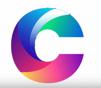
You'll get this as a result:
21. The highlight has been created perfectly. Now go ahead and change the opacity of the highlight a little bit so the highlight is subtle and not garish. If you want, you can also change the style of gradient from circular to linear or something else. I like the liner so I’ve chosen to do a linear gradient on my highlighted area.
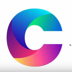
22. Repeat the process on the third segment of the logo, too, and there you have it! A perfect C logo, segmented and gradient-ed.